|
|
|

|
|
| DESIGN DETAILS |
DESIGN NAME:
Big N Ben
PRIMARY FUNCTION:
Ice Cream Packages
INSPIRATION:
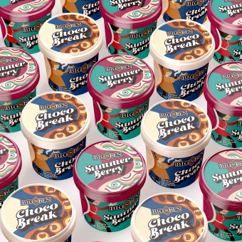
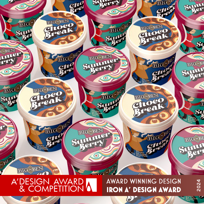
As it is clear from the name of the brand, all the design ideas are taken from England. Simple and dynamic character design inspired by famous British icons and characters.
UNIQUE PROPERTIES / PROJECT DESCRIPTION:
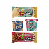
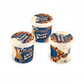
The use of old design patterns and different colors and well-known characters of England, each of which has different stories to tell, are considered unique features of this design series. The designs are such that it represents the name of the brand and its country. Next to the packaging, there is a direct reference to the type of product and its contents.
OPERATION / FLOW / INTERACTION:
The colors and characters in this packaging have been able to depict the identity of the brand, and the simplicity of the characters and the passionate coloring of the design does not target the packaging to a certain age range and attracts everyone.
PROJECT DURATION AND LOCATION:
This project started in November 2022 and continues until now.
FITS BEST INTO CATEGORY:
Packaging Design
|
PRODUCTION / REALIZATION TECHNOLOGY:
Designing and illustration done with Illustrator software. The packaging has a harmonious design structure and does a lot with little visibility.
SPECIFICATIONS / TECHNICAL PROPERTIES:
PP container
Printing method: IML
IML Applicable, Tamper Evident, Microwave capability, freezer capability
Capacity: 170 ml
Mouth: 80 mm
Depth: 62 mm
TAGS:
Ice cream, Ice cream Package, colorful, London, Big ben, Package Design, Pattern Design
RESEARCH ABSTRACT:
Type of research: studies
Research objectives: Identifying brand identity in the design along with the visual appeal of packaging and mental storytelling
Data collection: All the research and studies were selected through the internet and selected books and stories.
Participants or Experiments: Because the purpose of the brand is clear, research is planned based on public interest based on books and stories.
Results: According to the viewer's knowledge of the content of the packaging, the viewer's eyes were ready to accept the design, and the results of this work were very satisfactory.
CHALLENGE:
In the completed design, the biggest challenge of the designer was to come up with an idea and how to implement it in order to be able to introduce the product to the people according to its brand location and identity.
ADDED DATE:
2023-05-30 15:54:38
TEAM MEMBERS (1) :
IMAGE CREDITS:
All of the images: Illustrator / Creator: Mohsen Koofiani
|
| Visit the following page to learn more: https://bignben.uk/ |
|
| CLIENT/STUDIO/BRAND DETAILS |
 |
NAME:
Big N Ben
PROFILE:
the BIG N BEN is passionate about delivering top-notch products and services to our customers. they believe in quality, innovation, and exceptional customer service, and strive to make a positive impact in the lives of those we serve. With years of experience and a dedicated team of professionals and have established themselves as a leader in the ice cream industry.
BIG N BEN is dedicated to crafting the finest English ice cream using only the freshest and highest-quality ingredients. their passion for ice cream runs deep, and they are committed to bringing the rich and creamy taste of traditional English ice cream to every bite their serve. With a focus on quality and an unwavering commitment to their craft, they aim to be the go-to source for all of your ice cream needs.
BIGNBEN's goal is to continue to grow and provide unparalleled solutions that exceed the expectations of our customers.
|
|
|
| COMMENTS |
| Giulia Esposito |
Comment #99876 on June 22, 2024, 1:41 am |
|
The exceptional work titled "Big N Ben" in the realm of "Ice Cream Packages," which recently garnered the prestigious A' Design Award in the Packaging Design category, is a testament to the power of innovative packaging design. Drawing inspiration from the quintessentially British elements, the design brilliantly incorporates simple yet dynamic character illustrations inspired by famous British icons, setting a new benchmark in the industry. The unique combination of old design patterns, a variety of colors, and well-known English characters, each telling a different story, not only represents the brand and its country effectively but also creates a direct connection with the product's identity and contents. The meticulous research and planning based on public interest, alongside the challenges faced during the design process, culminate in a packaging that is not just visually appealing but also mentally engaging. The realization methods, which involved careful designing and illustration using Illustrator software, resulted in a harmonious design structure that communicates a lot with minimal visibility. This achievement underscores the importance of understanding brand identity and the role of visual storytelling in packaging design. The success of this project is a clear reflection of the creativity and dedication of the design team, led by the talented Mohsen Koofiani.
|
| Elisabeth Clark |
Comment #101268 on June 22, 2024, 6:20 am |
|
The accolade of the A' Design Award bestowed upon Mohsen Koofiani for the "Big N Ben" Ice Cream Packages is a testament to the exceptional creativity and thoughtfulness imbued in this packaging design. The unique amalgamation of old design patterns, vibrant colors, and quintessentially British characters, each with their own story, not only captures the essence of the brand and its country of origin but also stands as a beacon of innovative design in the packaging industry. Koofiani's meticulous approach to blending brand identity with visual appeal, through comprehensive research and a deep understanding of the brand's audience, has resulted in a design that is both visually engaging and rich in narrative. The clever use of England's iconic symbols and characters, interpreted in a simple yet dynamic way, serves as a brilliant inspiration for designers and brands aiming to create a deep connection with their audience. The success of "Big N Ben" in achieving such a harmonious balance between storytelling and product representation is truly laudable, and it is with great admiration that I celebrate Mohsen Koofiani's well-deserved recognition. This work not only sets a high standard for packaging design but also serves as a vivid reminder of the power of design in weaving together culture, brand identity, and consumer experience.
|
| Mark Allen |
Comment #102488 on June 22, 2024, 10:24 am |
|
The recognition of "Big N Ben" Ice Cream Packages with the prestigious A' Design Award in the Packaging Design category is truly deserved. The innovative integration of old design patterns, vivid colors, and iconic English characters, each narrating a unique story, brilliantly reflects the brand's identity and its origins. The meticulous research and thoughtful approach towards capturing public interest through well-known books and stories have culminated in a design that is not only visually appealing but also rich in content and storytelling. The challenge of conveying the product's identity and brand positioning through design has been met with exceptional creativity and execution. The use of Illustrator software for designing and illustration showcases a harmonious design structure that is effective in its simplicity. This work stands as a testament to the power of blending cultural elements with design to create packaging that resonates with consumers on multiple levels. Congratulations on this well-earned accolade, which highlights the profound impact of thoughtful and culturally rich packaging design in the modern market.
|
|
|
Did you like Mohsen Koofiani's Packaging Design?
You will most likely enjoy other award winning packaging design as well.
Click here to view more Award Winning Packaging Design.
Did you like Big N Ben Ice Cream Packages? Help us create a global awareness for good packaging design worldwide. Show your support for Mohsen Koofiani, the creator of great packaging design by gifting them a nomination ticket so that we could promote more of their great packaging design works.
|
|
|
|
|
|
