DESIGN NAME:
Remaking Art
PRIMARY FUNCTION:
Brand Identity
INSPIRATION:
The design inspiration comes from water reflection, using lines to connect the two obverse and reverse letters, and make full use of lines to separate plane materials, product design, and interior display. Clearly and concisely convey the spirit of re-inheriting brand culture, re-creating art, and re-integrating creativity.
UNIQUE PROPERTIES / PROJECT DESCRIPTION:
The logo design takes the initial letters R and A of the brand name Remaking Art, forming a symmetrical logo image up and down, using lines to connect the two letters, like a reflection in water, reflecting the brand concept“Remaking��.
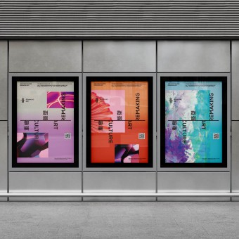
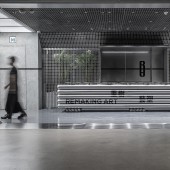
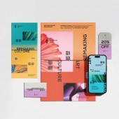
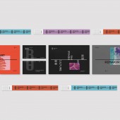
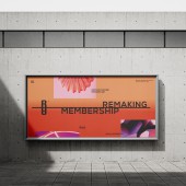
The overall VI visual system is focus on the concepts of symmetry, fusion, and innovation, making full use of lines to separate plane materials, product design, and interior display.
OPERATION / FLOW / INTERACTION:
First, the design team conducted in-depth research on the brand's history, values, and goals, determining the direction of brand integration and innovation. For the previous image, the design team retained the line elements and reimagined them into symmetrical forms to create new logos and visual elements, showcasing the brand's transformation and innovation. Subsequently, the design team continuously adjusted the design using design tools to ensure its consistency across different platforms and materials, allowing for smooth application in printed materials, product packaging, and spatial design to provide the audience with a tangible experience of the brand concept.
PROJECT DURATION AND LOCATION:
The project started in January 2022 and was completed in Shenzhen in May 2022
FITS BEST INTO CATEGORY:
Graphics, Illustration and Visual Communication Design
|
PRODUCTION / REALIZATION TECHNOLOGY:
In the new design ,the horizontal line in the logo symbolized a scale, expressing the brand's principles of fairness and integrity. Client wanted to retain the brand style, concept and some elements during rebranding, which has been taken into consideration as well.
SPECIFICATIONS / TECHNICAL PROPERTIES:
The overall design utilizes lines to connect two letters, resembling a reflection in water, highlighting the concept of brand reshaping. The design team focuses on the concepts of symmetry, integration, and innovation, using lines to separate different sizes of flat materials, packaging, and interior displays to convey the brand spirit in a concise and clear manner. Appropriate printing techniques and materials are chosen to ensure integrity across different sizes and materials.
TAGS:
Logo, Brand, Branding, Identity, Brand Identity, Logo Design, Creative, Visual Identity, Advertising,
RESEARCH ABSTRACT:
The previous logo of Remaking Art incorporated the initials "R" and "A" from the brand name. The letter "R" also resembled the Chinese oracle-bone inscription of character"human (pronounces Ren, means human)", representing the idea that "design should be people-oriented"; The horizontal line in the logo symbolized a scale, expressing the brand's principles of fairness and integrity. Client wanted to retain the brand style, concept and some elements during rebranding, which has been taken into consideration as well.
CHALLENGE:
The client wanted to keep the scale element line from the previous logo but in a more seamless and integrated manner within the new design.
ADDED DATE:
2023-05-29 09:42:27
TEAM MEMBERS (1) :
IMAGE CREDITS:
Copyright:CM Design
|
