Pinna Olive Oils Labels by Giovanni Murgia |
Home > Winners > #150744 |
 |
|
||||
| DESIGN DETAILS | |||||
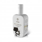
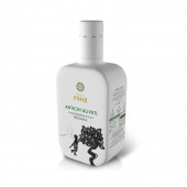
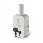
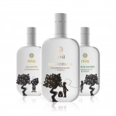
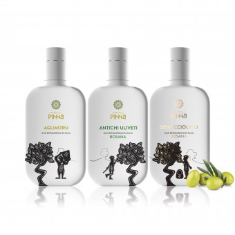
| DESIGN NAME: Pinna Olive Oils PRIMARY FUNCTION: Labels INSPIRATION: Family, territory, innovation. These virtues characterize the Fratelli Pinna brand, based in the village of Ittiri. The design communicates those values by taking as inspiration the work of the Sardinian designer Eugenio Tavolara. His philosophy and production has been considered revolutionary in Sardinia, as he introduced significant innovations in Sardinian handicrafts, creating an unique and distinctive style that influenced many other subsequent artists and artisans. UNIQUE PROPERTIES / PROJECT DESCRIPTION: The design has a minimal and clean appearance, being only characterized by the high contrast between the white of the bottle and the selected colors of the elements on the label. OPERATION / FLOW / INTERACTION: The project aims to create a contemporary, minimal and appealing design to transmit the Fratelli Pinna's vision, a balance between the values of innovation with the importance of being rooted to the land. This inseparable combination is conveyed through the visual metaphor inspired by the work of the Sardinian designer Eugenio Tavolara. PROJECT DURATION AND LOCATION: The project started in Sassari in October 2022 and finished in Sassari in February 2023. FITS BEST INTO CATEGORY: Packaging Design |
PRODUCTION / REALIZATION TECHNOLOGY: The bottle and label are a whole. This effect is due to the choice of the sleeve technology, which offers a wide design flexibility and high-quality prints that brings bright colors and sharp details. SPECIFICATIONS / TECHNICAL PROPERTIES: Label: 88,65 mm x 56,40 mm x 176,00 mm The label belongs to the "sleeve" type, therefore its surface completely covers that of the "Moresca" type bottle, specific for bottling products such as oil and vinegar. Moresca type bottle: 88,65 mm x 56,40 mm x 176,00 mm It has a square shape and a glass-green color. TAGS: oil, label, Sardinia, Italy, Tavolara, craftsmanship, territory RESEARCH ABSTRACT: The research of the works of the Sardinian designer Eugenio Tavolara was developed, particularly his approach to craftsmanship in relation to Sardinia identity. Several case studies from Tavolara's work were examined for their relevance to the values of the Fratelli Pinna brand. Illustrations were created depicting bucolic scenes of olive harvesting. The scenes, captured on the labels, are imagined as part of a single landscape, represented by a continuous line that extends from one label to the next. The bottles convey continuity and collectibility as a single set within the scene. CHALLENGE: The most challenging aspect of the work was rejuvenating the image of Fratelli Pinna without betraying the company's core values, such as attachment to the family and the land. The challenge involved bringing the history of this agricultural company into new products by dressing it in a contemporary dress, suitable for the new visual codes of the market. The project had to combine the values of contemporaneity and minimalism with those of a concrete and strongly identity-driven design. ADDED DATE: 2023-03-13 16:33:44 TEAM MEMBERS (3) : Art direction: Giovanni Murgia, Graphic Design: Viola Orgiano and 3D: Max Turrini IMAGE CREDITS: Image #1: Redfish Adv - Illustration: Viola Orgiano - 3D Artist Max Turrini - 2023 Image #2: Redfish Adv - Illustration: Viola Orgiano - 3D Artist Max Turrini - 2023 Image #3: Redfish Adv - Illustration: Viola Orgiano - 3D Artist Max Turrini - 2023 Image #4: Redfish Adv - Illustration: Viola Orgiano - 3D Artist Max Turrini - 2023 Image #5: Redfish Adv - Illustration: Viola Orgiano - 3D Artist Max Turrini - 2023 Video credits: 3D Artist Max Turrini - 2023 |
||||
| Visit the following page to learn more: https://rb.gy/sdgoyh | |||||
| AWARD DETAILS | |
 |
Pinna Olive Oils Labels by Giovanni Murgia is Winner in Packaging Design Category, 2022 - 2023.· Press Members: Login or Register to request an exclusive interview with Giovanni Murgia. · Click here to register inorder to view the profile and other works by Giovanni Murgia. |
| SOCIAL |
| + Add to Likes / Favorites | Send to My Email | Comment | Testimonials | View Press-Release | Press Kit | Translations |

