Nu Us Supplement Visual Identity by Salvita Bingelyte |
Home > Winners > #150619 |
 |
|
||||
| DESIGN DETAILS | |||||
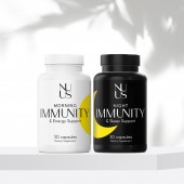
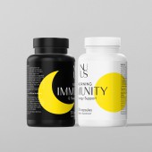
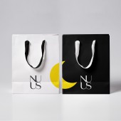
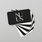
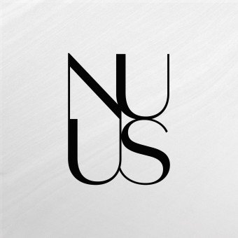
| DESIGN NAME: Nu Us Supplement PRIMARY FUNCTION: Visual Identity INSPIRATION: Design studio developed the brand design, packaging and visuals for Nu Us vitamin supplements. As a result of the stress and anxiety caused by recent years, consumers are searching for ways to boost their immune system and improve their health. These supplements consist of two day and night pills that provide a balanced daily dose and maximum vitamin absorption, supporting immunity twenty four hours. UNIQUE PROPERTIES / PROJECT DESCRIPTION: The logotype seamlessly blends four bold upper case letters into a cohesive image. Created using a sleek and elegant font, this logo is at once modern and timeless, conveying a sense of professionalism, sophistication, and strength. Thin strokes and sharp edges convey a sense of precision and attention to detail, while the even spacing and consistent thickness of the strokes ensure that the logo is easy to read and visually appealing. OPERATION / FLOW / INTERACTION: The morning capsules are contained in a white bottle, whereas the night capsules are placed in a black bottle. The packaging has been designed in a simple yet elegant manner using the colors black and white to reflect the highest quality. Additionally, to make the design more appealing, these designs use simple sun and moon shapes in bright yellow to catch the eye. Yellow shines with optimism, happiness and has the ability to infuse energy, and evoke positive emotions. PROJECT DURATION AND LOCATION: Started in August 2022 and finished February 2023 in Vilnius, Lithuania. FITS BEST INTO CATEGORY: Graphics, Illustration and Visual Communication Design |
PRODUCTION / REALIZATION TECHNOLOGY: Screen printing SPECIFICATIONS / TECHNICAL PROPERTIES: Label is Width 163 mm x Height 60 mm, Business card: 55 mm x 91 mm, Shopping bag: 320 mm x 172 mm x 260 mm TAGS: Supplement, immunity, logotype, visual identity, brand identity, graphic design, branding, Salvita Bingelyte, Salvita Design, Lithuania RESEARCH ABSTRACT: Nowadays, it is crucial to have a design that is straightforward and uncomplicated. The brand has opted for a minimalistic approach, using basic fonts and limited colors that create a relaxed and uncomplicated vibe. Despite the simplicity, the design effectively distinguishes between the day and night capsules, ensuring clarity, functionality and quality. CHALLENGE: The name was chosen for its simple words. Nu Us is pronounced as new us, therefore the meaning of the name is to feel new again. The primary objective was to develop a product that could induce a sense of tranquility, rather than adding more chaos to an already stressful life. Therefore, the design was opted for a minimalistic approach that would not overload the consumers with too many visual elements. Although this was challenging, it succeeded in creating a clean and simple design that stands out. ADDED DATE: 2023-03-08 21:12:02 TEAM MEMBERS (1) : IMAGE CREDITS: Salvita Bingelyte, 2022. |
||||
| Visit the following page to learn more: https://www.salvita.lt | |||||
| AWARD DETAILS | |
 |
Nu Us Supplement Visual Identity by Salvita Bingelyte is Winner in Graphics, Illustration and Visual Communication Design Category, 2022 - 2023.· Read the interview with designer Salvita Bingelyte for design Nu Us Supplement here.· Press Members: Login or Register to request an exclusive interview with Salvita Bingelyte. · Click here to register inorder to view the profile and other works by Salvita Bingelyte. |
| SOCIAL |
| + Add to Likes / Favorites | Send to My Email | Comment | Testimonials | View Press-Release | Press Kit |
Did you like Salvita Bingelyte's Graphic Design?
You will most likely enjoy other award winning graphic design as well.
Click here to view more Award Winning Graphic Design.


