DESIGN NAME:
Golden Oak
PRIMARY FUNCTION:
Wine Packaging
INSPIRATION:
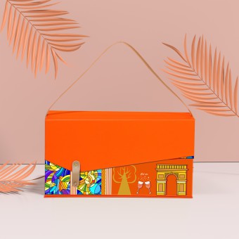
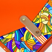
The sound of French wine rang through the sky. Hermes is a French luxury brand. The packaging uses Hermes orange, reflecting the high end quality of red wine. This product adopts orange as the main color, and its contrasting color blue is used as the auxiliary color, incorporating vector style and stained glass style, which can attract the attention of high-end young users and spread French wine culture.
UNIQUE PROPERTIES / PROJECT DESCRIPTION:
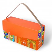
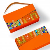
Golden Oak is based on French red wine culture and Hermes orange, reflecting the high end of the product. The packaging design uses various French red wine elements to give people psychological hints, such as golden oak, grapes, red wine bottles, wine glasses, triumphal arch etc., showing high end aristocratic temperament. The combination of blue and luxurious Hermes orange expresses the understanding and interpretation of French red wine. Integrating vector style and Church sained glass style.
OPERATION / FLOW / INTERACTION:
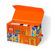
There is a high-grade leather lock on the front of the product. Open the leather buckle, you can see that the product has two compartments, which can hold double bottles of red wine. After drinking the red wine, customers can take out the black pearl cotton lining, place other items inside, and use the product packaging as decoration.
PROJECT DURATION AND LOCATION:
The project was launched in Hangzhou in November 2022 and finished in March 2023.
FITS BEST INTO CATEGORY:
Packaging Design
|
PRODUCTION / REALIZATION TECHNOLOGY:
The wine packaging of this product uses special paper wrapped in 2.5 gray boards as the main material, and the surface is covered with high definition patterns by digital printing. The buckle and handle are made of high grade leather for durability.
SPECIFICATIONS / TECHNICAL PROPERTIES:
The width is 390mm, the depth is 130mm, and the height is 200mm. It is made of art paper with high quality.
TAGS:
Wine Packaging, French, High End, Double Bottle Wine, Packaging Design
RESEARCH ABSTRACT:
The packaging aims to better present the red wine, which extracts the classic elements of red wine culture and French culture as packaging patterns. It helps customers clarify the category and origin of the wine. The packaging design uses a more youthful and creative vector style, combined with the stained glass style of European churches.
CHALLENGE:
There are two difficulties in the packaging design of this product. One is how to perfectly combine French wine culture, vector style, Church stained glass style and many other elements and styles, and present them in the packaging. After the customer purchases, how to make the user think that the packaging has reusable value and not discard the product is another difficulty.
ADDED DATE:
2023-03-03 13:43:30
TEAM MEMBERS (2) :
Leijing Zhou and Yinli Huang
IMAGE CREDITS:
Yinli Huang
|

