DESIGN NAME:
Moonshot Cafe
PRIMARY FUNCTION:
Exhibition Booth
INSPIRATION:
This design is for the Japan Pavilion at the CES 2023, one of the largest technology conventions in the glove. Therefore, it would be great if the design somehow makes people feel the uniqueness of Japan. The design is inspired from simplicity and minimization, the fundamental concept of Zen, which Japan has always been with since ancient times.
UNIQUE PROPERTIES / PROJECT DESCRIPTION:
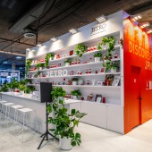
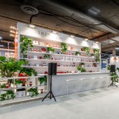
First, it’s rare to have a cafe, rather than having a normal exhibition booth in a convention. The space tries to become an oasis where the conversation begins in a busy convention. Secondly, the space focuses on transparency and spaciousness since the ceiling of the venue is very low. Therefore, this space gets more attendees’ attention in the convention. Third, the space has lots of green, showing the eco-friendly attitude, reducing waste from exhibition, and creating a cozy atmosphere. Finally, the decoration art in the cafe counter is carefully chosen to show modern and latest Japan.
OPERATION / FLOW / INTERACTION:
Unlike the normal exhibition booth in a convention, people enjoy drinks and conversation in a cozy mingling lounge, which we named it Moonshot Cafe. The name is decided in the hope that moonshot, in other words, giant leap will come out from this space. One of the best ways to achieve the goal, appealing products and services to the world, is to create a space that would generate more conversation and interaction between exhibitors and participants. The more conversation and communication would eventually lead to the realization of the goal, creating a giant leap.
PROJECT DURATION AND LOCATION:
The project started in August 2022 in San Francisco and finished in January 2023 in Las Vegas, and was exhibited in CES 2023 in January 2023.
FITS BEST INTO CATEGORY:
Interior Space and Exhibition Design
|
PRODUCTION / REALIZATION TECHNOLOGY:
The ceiling of the venue is very low so that transparency and spaciousness is one of the most important aspects to get attendees’ attention in a convention. Therefore, the design focuses on not using many walls and keeping the exhibition table height low. People can appreciate the unobstructed view from one end to the other in this space. In addition, in a technology themed convention, most booths use cold white lighting since the color of cold white might remind people of technology, however, the space intentionally uses warm white lighting to attract people and create a cozy atmosphere of a cafe.
SPECIFICATIONS / TECHNICAL PROPERTIES:
The booth area is 90 feet x 50 feet. In other word, 2743 mm x 1524 mm.
TAGS:
Zen, minimization, transparency, spaciousness, simplicity, exhibition design, convention, Japan, cafe,
RESEARCH ABSTRACT:
In terms of design, how we can create more conversation and interaction in an exhibition booth is one of the biggest questions because the communication between exhibitor and attendee could create new business. Literature review and field work by joining other conventions has been done. The results improve the design, production and realization such as using white warm color lighting, music, aroma oil and green, transparency and spaciousness.
CHALLENGE:
The biggest challenge is the height of the ceiling of the venue, which is very low and also the venue does not permit hanging from the ceiling, while hanging signs are one of the main tools to attract people who join conventions. In this situation, transparency and spaciousness is one of the most important aspects to motivate attendees to come to the area. Therefore, the design focuses on not using many walls and keeping the exhibition table height low. People can appreciate the unobstructed view from one end to the other in this space.
ADDED DATE:
2023-02-28 21:22:42
TEAM MEMBERS (1) :
IMAGE CREDITS:
Takeshi Yoshida, 2022.
|


