Nu Us Supplement Packaging by Salvita Bingelyte |
Home > Winners > #150140 |
 |
|
||||
| DESIGN DETAILS | |||||
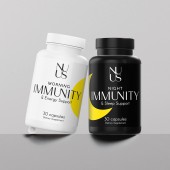
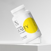
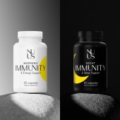
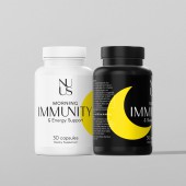
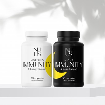
| DESIGN NAME: Nu Us PRIMARY FUNCTION: Supplement Packaging INSPIRATION: Salvita Design created a new brand identity and clever packaging for the vitamin supplement, Nu Us. The stress and anxiety of the last few years has driven consumers to seek ways to improve their health by strengthening their immune system. With a balanced daily dose of two unique pills, Nu Us supplements are made to support twenty four hours immunity with maximum vitamin absorption. The morning capsule boosts energy and balances stress levels while the night capsule improves sleep quality. UNIQUE PROPERTIES / PROJECT DESCRIPTION: It was necessary to clearly distinguish the difference between the day and night capsules, so the idea of white and black bottles was apparent. The sun and moon symbols also distinguish the different supplements, but when the bottles are placed together, the symbols beautifully merge into one whole, emphasizing the need to consume the capsules together for maximum effectiveness. The logo font and the main word immunity are uniquely created by subtly combining letters. OPERATION / FLOW / INTERACTION: Black and white packaging is timeless and will never go out of style. It reflects the highest quality with simplicity and elegance. To add an interesting twist, these designs use simple sun and moon shapes in bright yellow to catch the eye. Yellow shines with optimism, enlightenment and happiness. It instills energy, evokes pleasant feelings and captivates the viewer with ease. On the labels, the elegant uppercase font creates a dominant aesthetic and portrays a transparent and honest brand. PROJECT DURATION AND LOCATION: Started in August 2022 and finished February 2023 in Vilnius, Lithuania. FITS BEST INTO CATEGORY: Packaging Design |
PRODUCTION / REALIZATION TECHNOLOGY: Screen printing SPECIFICATIONS / TECHNICAL PROPERTIES: Label is Width 163 mm x Height 60 mm TAGS: Supplement, immunity, labels, packaging design, brand identity, graphic design, branding, Salvita Bingelyte, Salvita Design, Lithuania RESEARCH ABSTRACT: Creating a direct, no fuss packaging design is an absolute necessity nowadays. The packaging has simple fonts and minimal colours that give it a light hearted quality while still highlighting the day and night capsules. CHALLENGE: The goal was to create a product that would provide a calming aura rather than a burst of color in an already stressful life. There was no advantage in overwhelming consumers with too many design elements, so a minimalist, clean design was chosen. The most difficult thing was to come up with a way that would spice up the packaging and give it uniqueness. The result is a new, stand out product design with a creative twist. ADDED DATE: 2023-02-28 19:30:29 TEAM MEMBERS (1) : IMAGE CREDITS: Salvita Bingelyte (Stylist / Photographer) Erin Hope Stevens (Copywriter) |
||||
| Visit the following page to learn more: https://www.salvita.lt | |||||
| AWARD DETAILS | |
 |
Nu Us Supplement Packaging by Salvita Bingelyte is Winner in Packaging Design Category, 2022 - 2023.· Read the interview with designer Salvita Bingelyte for design Nu Us here.· Press Members: Login or Register to request an exclusive interview with Salvita Bingelyte. · Click here to register inorder to view the profile and other works by Salvita Bingelyte. |
| SOCIAL |
| + Add to Likes / Favorites | Send to My Email | Comment | Testimonials | View Press-Release | Press Kit |
Did you like Salvita Bingelyte's Packaging Design?
You will most likely enjoy other award winning packaging design as well.
Click here to view more Award Winning Packaging Design.


