Vicutu Concept Flagship Store by Antistatics Architecture |
Home > Winners > #150086 |
 |
|
||||
| DESIGN DETAILS | |||||
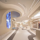
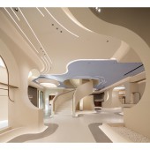
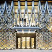
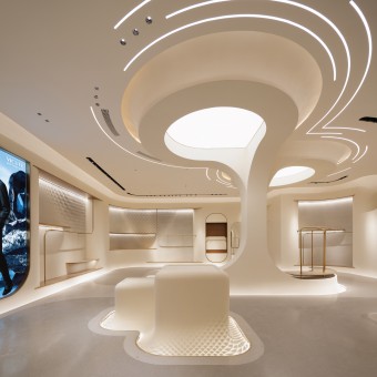
| DESIGN NAME: Vicutu Concept PRIMARY FUNCTION: Flagship Store INSPIRATION: Within the interior of the concept store, the whole space language simulates the mountains, waterfalls, deserts, and celestial phenomena in the nature, creating an immersive place of endless rebirth and nirvana, reflecting the perseverance of mankind. Textured artistic cement wall reflects a classic, low-key, and sculptural environment. The Continuous curvilinear space is created through a geometric language distilled from flowing and draping fabrics. UNIQUE PROPERTIES / PROJECT DESCRIPTION: The Concept Store for the Vicutu Fashion Brand, architecturalizes and spatializes the core elements of the brand through the exploration, manipulation, and reinvention. The clothing attributes of the fashion industry are reinterpreted through futuristic vision and exquisite architectural language, providing customers with a unique experience while remaining true to the expression of the fabric, tailoring and quality of the fashion. The space creates deeply experiential engagement with visitors. OPERATION / FLOW / INTERACTION: Throughout the store, the woven diagrid language creates a unity through its varied expression and implementation as detail. Embedded as relief within pedestals, as graphic within floor patterns and as a three-dimensional lattice in the interior façade, this geometry adds an additional layer of reference to the woven nature of fashion, both literally as a means of producing fabric, but additionally as an expression of the client, as a leader in the industry, who has become interwoven position within the artistic development of Chinese fashion. The project serves as a deep and multifaceted showpiece for the client to exhibit not only the latest designs of the brand, but also as a means of illustrating the potentials for innovation within unique collaborations with other industries like architecture. The space creates deeply experiential engagement with the visitor through the fine attention to detail across the scale of the project. Promoting the physical experience of space and fashion, the space offers a retreat from the digital world. PROJECT DURATION AND LOCATION: Within three years of design and construction (2020-2022), the brand new Vicutu concept store is appeared at the promenade street front of Shangde Center in Daxing District, Beijing. It is divided into upper and lower floors, with a total building area of 1680 square meters, including three brands Gornia, Vicutu Blue Label and Vicutu Red Label. The design concept is extracted from the "V" shape of the Vicutu brand and integrated into the flexible blending to form an ecological weaving system from the stiching natural of the fashion fabric. The continuous language exhibits throughout the architectural facade to the interior special language and details. FITS BEST INTO CATEGORY: Interior Space and Exhibition Design |
PRODUCTION / REALIZATION TECHNOLOGY: For the first time in the architectural industry, a large-scale three-dimensional aluminum woven diagrid system is adopted, which reflects the production process and fabric properties of men's clothing on the facade. Textured artistic cement wall reflects a classic, low-key, and sculptural environment. All walls and display counters "grow" from the ground and the ceiling, at the meantime the effect of continuity and growth is enhanced through hidden light sources. Throughout the store, the growth pattern language creates a unity through its varied expression and implementation as detail. Embedded as relief within pedestals, as graphic within floor patterns and as a three-dimensional lattice in the interior façade. Special fabricated GRG panels with "diagrid" patterns are built within the wall details. SPECIFICATIONS / TECHNICAL PROPERTIES: Similar to the nature of tailoring flat fabrics into three dimensional garments, the construction of the façade comes from an innovative fabrication process of bending and flexing aluminum sheets into doubly curved geometries. The facade is all prefabricated panels and installed on site precisely. The architecture area of the store is 1,680 sqm, divided in two stories. TAGS: Immersive, digital fabrication, diagrid, fashion, growth, futuristic, innovation, weaving, experience RESEARCH ABSTRACT: The design concept is extracted from the "V" shape of the Vicutu brand and integrated into the flexible bending to form an ecological weaving system from the stitching natural of the fashion fabric. The continuous language exhibits throughout the architectural facade to the interior special language and details. Within the interior of the concept store, the whole space language simulates the mountains, waterfalls, deserts, and celestial phenomena in the nature, creating an immersive place of endless rebirth and nirvana, reflecting the perseverance of mankind. Textured artistic cement wall reflects a classic, low-key, and sculptural environment. CHALLENGE: The challenge of the work is utilizing the different construction tectonics in one project from exterior to interior. Also, how to apply a continuous curvilinear geometry into a large space, though scale changes, from façade panels to the interior wall and ceiling, to the display podium, considering both traditional way of construction through standard arches and lines, and inserting customized panels from digital fabrication. ADDED DATE: 2023-02-28 16:53:43 TEAM MEMBERS (1) : Architect’ Firm: AntiStatics Architecture, Lead Architects: Mo Zheng, Martin Miller, Project Architect: Christopher Beckett, Team: Yasser Hafizs, Luke Theodorius E.D.Santoso, Frank Feng, Annie Liu, Dhaga Aman, Wenlin Bai, Yue Xi, Boyan Zhang, Arthur Yang, Yong Li, Weidong Zhang, Zhiming Wu, Changyong Guo, Jingwei Zhang, Client:VICUTU (Beijing Gelei Fashion Technology Co., Ltd), Main Contractor: Beijing Chenfeng Polang Architectural Decoration Engineering Co., Ltd., GRG Fabricator: E-grow Shanghai IMAGE CREDITS: Photo credits: UK Studio, AntiStatics Video Credits: AntiStatics PATENTS/COPYRIGHTS: Copyrights belong to AntiStatics Architecture, 2023. |
||||
| Visit the following page to learn more: https://www.antistatics.net/ | |||||
| AWARD DETAILS | |
 |
Vicutu Concept Flagship Store by Antistatics Architecture is Winner in Interior Space and Exhibition Design Category, 2022 - 2023.· Press Members: Login or Register to request an exclusive interview with Antistatics Architecture. · Click here to register inorder to view the profile and other works by Antistatics Architecture. |
| SOCIAL |
| + Add to Likes / Favorites | Send to My Email | Comment | Testimonials | View Press-Release | Press Kit |

