DESIGN NAME:
Reduction
PRIMARY FUNCTION:
Residence
INSPIRATION:
Light and shadow, circulation, spacing, color, and other details lead to the overall style of a space. The design team believes that interior design is not for the sake of designing a home but because of the expectations, perceptions, and unique memories of a life so that the unique beauty of the space can be constructed. Such a color tone and efficiency of use allow users to look forward to and enjoy an exclusive place, which is called 'home'.
UNIQUE PROPERTIES / PROJECT DESCRIPTION:
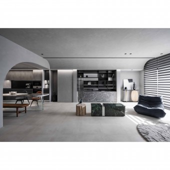
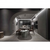
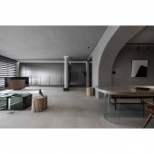
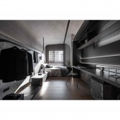
Firstly, the space is divided into two, defining the smoothness of each area and path and controlling the introduction and flow of natural lighting. Secondly, with minimalism, the spatial concept is transformed into a simple and modern one. The grayscale, concealed doors, and cabinets combine functionality and aesthetics and create visual consistency to form an ideal aesthetic space. The interior is made of heterogeneous grayscale, supplemented by linear lighting, and changing textures to present an unconventional, extended, and spacious view from far to near.
OPERATION / FLOW / INTERACTION:
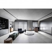
The boundary between the public and private areas is clearly defined. Compared to the standard plan of a sofa against the TV wall, this living room has a reduced design to provide a large space with concealed doors and sliding doors, so that the windows, doors, and cabinets can be integrated into one. From a distance, it looks like an exhibition space that can give users a healing atmosphere with infinite extension and deep precipitation. The contrast of lighting, the texture of hand-painted coating, and the delicacy of the grayscale bring users a completely different experience at every turn.
PROJECT DURATION AND LOCATION:
The project finished in Taiwan.
FITS BEST INTO CATEGORY:
Interior Space and Exhibition Design
|
PRODUCTION / REALIZATION TECHNOLOGY:
To build harmony, the perfect combination of materials injects a new dimension of diversity and depth into the space. For example, serpentine, Roman green, hand-made texture special paints, metal sheets, stainless steel, imported laminate hard plastic sheet, iron parts, baking paint, moru glass, terrazzo walls, multi-functional guest room, restaurant pavement, laminate flooring, pink woodwork stain for children's room, track lighting, metal door piece, and imported slate, etc.
SPECIFICATIONS / TECHNICAL PROPERTIES:
The site is 148.7 square meters, with three rooms and two bathrooms. The design team replanned the original four-bedroom layout into three rooms and took the concept of gallery-style exhibition space to describe it. The open plan connects the tangible and intangible interactions between people and space. The fields outlined by the circulation, materials, and lighting plan implicitly echo each other, seemingly merging into one but revealing different layers and techniques in each area.
TAGS:
Continuity of state, Sustainable space, Spatial layers, Translation of classical Rome, Technological ambience
RESEARCH ABSTRACT:
In the case of designing public and private spaces, 'reduction'; is at the core of the project, to minimize and restore the original textures of the interior to create a flexible and accessible space. This concept also applies to the color scheme. The project uses a low-saturation gray natural mineral coating to reduce visual stress and create a harmonious look. In this way, the furniture and occupants can better express their unique personalities.
CHALLENGE:
The design team carried out the project with a vision, knowledge, and enthusiasm. From conception to execution, harmonizing the client's expectations and the design team ideas into the interior was the challenge of the project and the most time-consuming and labor-intensive part. To realize a 'reduction'; concept, the design team took different materials in the same color tone to present a brand-new mix of classical and modern.
ADDED DATE:
2023-02-25 12:34:42
TEAM MEMBERS (1) :
IMAGE CREDITS:
ACG Design International
|
