DESIGN NAME:
Profound Dimensions
PRIMARY FUNCTION:
Office
INSPIRATION:
The design is inspired by nature, minimalism, and simplicity, while avoiding the modernism of excessive decoration and contrasting colors.
The three dimensional space conveys the harmony and contrast of structure and proportion through the characteristics of materials, construction techniques, and volume, while the color logic of juxtaposing wood colors in light and dark shades of gray, subtly endows the space a constant frequency with excellent inclusiveness, ensuring that even if people stay in the space for a long time, they still have a comfortable and stress-free perception in the interior space.
UNIQUE PROPERTIES / PROJECT DESCRIPTION:
This project involves a single-story commercial space with an actual interior area of about 30 square meters.
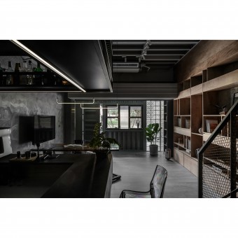
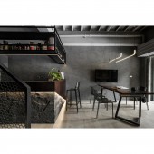
In consideration of the long rectangular shape of the space, and the need to meet the multiple purposes of reception, discussions, exhibition, light food, and staff recreation according to the intended usage needs, the overall space emphasizes an open configuration, with the front section pushed out by more than one meter to increase the usable depth, and with a distinct facade design to create an exclusive brand image and enhance brand recognition. The interior décor combines movable furniture, lighting, ladder track, continuous surface shapes and a bar area to versatilely define the functions of individual units, making for a comfortable space that allows for versatile and dynamic use, juxtaposed with a transparent and open view. The interior features an understated yet distinctive industrial style, and the rich sensory layers from top to bottom and from left to right are gradually outlined in a blend of shades of gray and warm-colored wooden texture.
OPERATION / FLOW / INTERACTION:
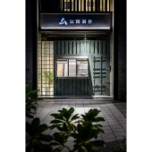
In consideration of the activity patterns and functional use frequency, the front section of the space echoes the entrance foyer with a slight height difference, which in turn highlights the window opening at the waist level of the facade; it resembles the creative main visual of a café or a high-stool bar. In addition, the long row of glass tiles on the left side of the facade draws light and shadow in, and the deliberate convergence of light bands that encircle the first and second floors at night, as well as the backlit store sign illumination effect, offering an entertaining initial sensory exploration for visitors.
PROJECT DURATION AND LOCATION:
The project finished in July 2022 in Taoyuan City, Taiwan.
FITS BEST INTO CATEGORY:
Interior Space and Exhibition Design
|
PRODUCTION / REALIZATION TECHNOLOGY:
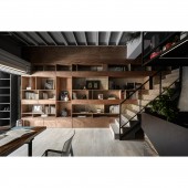
On account of the spirit of energy conservation and waste reduction, the materials selected for the whole project require minimum processing, low levels of formaldehyde and mostly recyclable basic materials, such as bake-finished sheet metal in celadon for the facade, plywood staining for the large cabinets under the interior beams, and a Wood Wool Cement Board (WWCB) foundation for sound and heat insulation, followed by bevel-cut rusted steel and surface stone for the bar, metal mesh for the staircase handrails and hangers, and special paint for the walls with a swashbuckling treatment, etc. In addition to shaping the obvious style of the space, the project also takes into account the details of refinement and the characteristics of different materials.
SPECIFICATIONS / TECHNICAL PROPERTIES:
33.058m2
TAGS:
-
RESEARCH ABSTRACT:
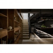
The large display cabinets against the interior walls seemingly stretch upward, but in fact, they are made of continuous materials to cover and beautify the huge structure, subtly eliminating the sense of spatial confinement. The staircase line of the upper floor is kept at the turn of the staircase, which not only lightens the staircase, but also allows light and shadow to flow freely. The front half of the interior removes the ceiling shade, which on the one hand raises the visual height through the shadows of the lines, and on the other hand connects the various parts of the space with each other using gray paint.
CHALLENGE:
The overall appearance is a bold break from the standard commercial facade image, combined with custom lacquered sheet metal components in celadon, into a container-like industrial ambience, and the window high bar is also integrated with hardware components, built-in top cover, folding windows, countertops and other multi-functional use. The top cover is also covered with imitation cement film, which can be used as a notice board when closed.
ADDED DATE:
2023-02-24 08:35:48
TEAM MEMBERS (1) :
IMAGE CREDITS:
CCH IMAGE STUDIO
|
