Animated Koopmans Logo Corporate Identity by Ruud Winder - Rebrandt |
Home > Winners > #149078 |
 |
|
||||
| DESIGN DETAILS | |||||
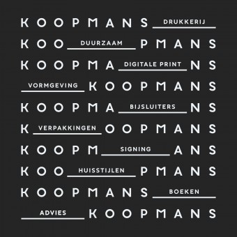
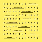
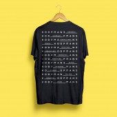
| DESIGN NAME: Animated Koopmans Logo PRIMARY FUNCTION: Corporate Identity INSPIRATION: The designer wanted the dynamic working attitude of the organization to be reflected in the designs. The movement contrasts with the supposed stillness of a print company, precisely that breadth had to be emphasized. UNIQUE PROPERTIES / PROJECT DESCRIPTION: Koopmans asked the rebranding agency to communicate the breadth of the range more clearly. The word 'print shop' no longer represents what they do. This new ID is therefore not only an aesthetically appealing design language, but also a strategic marketing instrument that communicates the wide range of products they can offer. The animated logo (see video) is the basic logo of this company. Koopmans uses it everywhere; online, in videos and all kind of presentations. OPERATION / FLOW / INTERACTION: Logosystem is moving as an abacus, slidely moving from one to the other option. Animation is made by Peter Puntman and online by Kaz van Wel. PROJECT DURATION AND LOCATION: From concept to realisation approximately 3 months. FITS BEST INTO CATEGORY: Graphics, Illustration and Visual Communication Design |
PRODUCTION / REALIZATION TECHNOLOGY: - SPECIFICATIONS / TECHNICAL PROPERTIES: - TAGS: Typographic, animated logo, logo system RESEARCH ABSTRACT: Company exists more than 70 years, this history needs to be carried by this new design too. With the typography the design is timeless with a small hint to history. CHALLENGE: The hardest part was getting the typography into a solid balance. After hundreds of versions Rebrandt finaly succeeded. ADDED DATE: 2023-02-23 16:44:18 TEAM MEMBERS (4) : Ruud Winder — concept & design, Linda Kaandorp — dtp, Peter Puntman — animation and Kaz van Wel — website + html5 animation IMAGE CREDITS: Ruud Winder - Rebrandt 2022 PATENTS/COPYRIGHTS: Ruud Winder - Rebrandt 2022 |
||||
| Visit the following page to learn more: https://www.rebrandt.com/en/koopmans | |||||
| AWARD DETAILS | |
 |
Animated Koopmans Logo Corporate Identity by Ruud Winder-Rebrandt is Winner in Graphics, Illustration and Visual Communication Design Category, 2022 - 2023.· Press Members: Login or Register to request an exclusive interview with Ruud Winder - Rebrandt. · Click here to register inorder to view the profile and other works by Ruud Winder - Rebrandt. |
| SOCIAL |
| + Add to Likes / Favorites | Send to My Email | Comment | Testimonials | View Press-Release | Press Kit |


