Uebaa Branding by Marcelo Ruis Vargas Martinelli |
Home > Winners > #148861 |
 |
|
||||
| DESIGN DETAILS | |||||
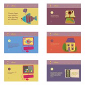
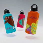
| DESIGN NAME: Uebaa PRIMARY FUNCTION: Branding INSPIRATION: The Uebaa brand needed to find its own branding language, which would develop narratives for its final audience, children and their parents, building an affective connection with them. The tone of the brand's speech was rethought and a series of ludic narratives, illustrations and pictograms were created to bring Uebaa closer to its audience. Applied to surfaces, social media, stationery, the website and much more, the images are basis for the exposure of the fun and childlike spirit of the brand. UNIQUE PROPERTIES / PROJECT DESCRIPTION: Based on four pillars namely playful, functional, sustainable and aesthetic, the Uebaa brand manages to have its communication oriented towards the development of products that offer tangible benefits to its public. The pillars are graphically translated by an extensive palette of colors and illustrations that stimulate creativity and imagination. The brand Uebaa starts to communicate in an authentic way through its own and unmistakable visual elements, becoming a reference in its business segment. OPERATION / FLOW / INTERACTION: The new brand identity project of the Uebaa brand allowed it to appropriate the universe of childlike language with authority, without incurring a model permeated with cliches. The brand identity uses illustrations to pragmatically exemplify its brand basis namely playful, functional, sustainable and aesthetic. The visual language is for children, but the brand basis aim to dialogue with parents. PROJECT DURATION AND LOCATION: The project started in June 2020 and finished in June 2022 in Sao Paulo, Brazil. FITS BEST INTO CATEGORY: Graphics, Illustration and Visual Communication Design |
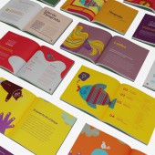
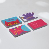
PRODUCTION / REALIZATION TECHNOLOGY: Most of the graphic materials were produced in offset in CMYK-scale colors. Original site development in PHP language. The illustrations were developed digitally. SPECIFICATIONS / TECHNICAL PROPERTIES: Brandbook, format 180 x 180 mm, 96 pages. Tag, sheet format 50 x 90 mm, printed on offset paper 300 g/m2., 4X0 colors (CMYK). Card, sheet format 50 x 85 mm printed on offset paper 300 g/m2., 4X4 colors (CMYK). TAGS: Branding, visual identity, brand identity, illustration RESEARCH ABSTRACT: The Laika method is based on the synergy between linguistic and pictorial skills. Every project begins with the construction of meaning, an affirmation, and the need to design small graphic narratives. Thus, the visual identity project expands upon the detailed and strategic work of building an imaginary universe that represents the culture of the Uebaa brand. CHALLENGE: The brand language encountered significant implementation challenges. For it is a extensive identity system, with several elements of visual identity and an extensive color palette, the brand book required detailed treatment of the rules and guidelines for use, especially in the integration of identity elements with typography. The line's sub-brands, Toca and Pingo, expanded the Uebaa business model, but also required restrictions on the integrated use with the parent brand. ADDED DATE: 2023-02-21 18:01:06 TEAM MEMBERS (1) : Ruis Vargas, Creative Director and Illustrator; Agnes Svilenov and Lorenzo Morelatto, graphic designers IMAGE CREDITS: Laika Design |
||||
| Visit the following page to learn more: http://www.laika/com.br | |||||
| AWARD DETAILS | |
 |
Uebaa Branding by Marcelo Ruis Vargas Martinelli is Winner in Graphics, Illustration and Visual Communication Design Category, 2022 - 2023.· Press Members: Login or Register to request an exclusive interview with Marcelo Ruis Vargas Martinelli. · Click here to register inorder to view the profile and other works by Marcelo Ruis Vargas Martinelli. |
| SOCIAL |
| + Add to Likes / Favorites | Send to My Email | Comment | Testimonials | View Press-Release | Press Kit |


