|
|
|


|
|
| DESIGN DETAILS |
DESIGN NAME:
Abaliss Sans
PRIMARY FUNCTION:
Typeface Specimen
INSPIRATION:
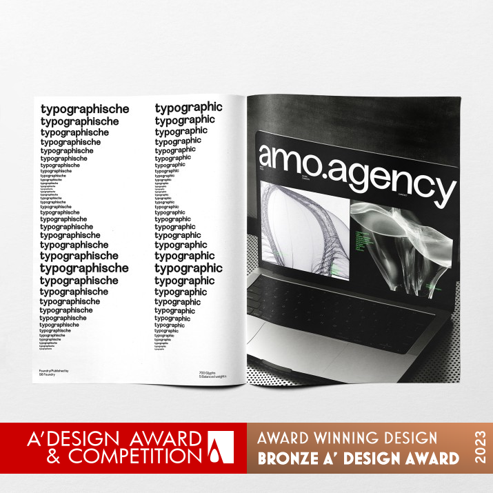
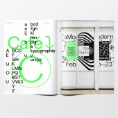
The inspiration for the typeface family is based on the shifting aesthetics of modernism. The layout of the specimen was influenced by the layout structures and experiments of Emil Ruder., Weingart and Hofman.
UNIQUE PROPERTIES / PROJECT DESCRIPTION:
Abaliss Sans is a contemporary typeface family based on the swiss style with strong stylistic geometric contrasts representing the shifting contemporary aesthetics. Its distinctive stance and wide-open counters allow the right visual consistency for branding and communications projects.
OPERATION / FLOW / INTERACTION:
The Specimen was a limited run and sent to existing customers
PROJECT DURATION AND LOCATION:
The Typeface was started in 2022 and finished in 2023
FITS BEST INTO CATEGORY:
Graphics, Illustration and Visual Communication Design
|
PRODUCTION / REALIZATION TECHNOLOGY:
The typeface was developed in Glyphs
SPECIFICATIONS / TECHNICAL PROPERTIES:
The Specimen was printed CMYK with one special fluorescent green.
TAGS:
Font design, Branding, Identity, Type design
RESEARCH ABSTRACT:
Researching the form shape and structure of the font, lead us to examine early 20th centry fonts from humanistic to geometric styles, helping to evolve the present forms.
CHALLENGE:
The research challenge was to create forms that were an innovation in the stylistic feeling of the typeface family
ADDED DATE:
2023-02-13 12:37:32
TEAM MEMBERS (1) :
Paul Henry Robb
IMAGE CREDITS:
Copyright 2023 Paul Henry Robb
|
| Visit the following page to learn more: https:// https://www.youworkforthem.com/font/T18648/ab
aliss |
|
| CLIENT/STUDIO/BRAND DETAILS |
 |
NAME:
S6 Foundry
PROFILE:
S6 Foundry develops creative fonts by designers for designers. Based in Italy they are an independent contemporary digital type foundry crafting retail typefaces for use in digital and print applications. S6's mission is to create top-tier fonts for contemporary designers. They strive to provide original typefaces that meet the needs and challenges of today's design landscape, both for text and display use, focusing on producing high-quality fonts that look great and enhance designs.
|
|
|
| COMMENTS |
| Giulia Esposito |
Comment #95921 on June 20, 2023, 10:46 pm |
|
I'm absolutely in awe of the Abaliss Sans Typeface Specimen. The level of detail and thought that has gone into the design is remarkable. The intricate elements and powerful visual communication have really brought the entire project to life. It's an absolute delight to observe how the design has achieved its purpose. Every font style, colour and size is beautifully balanced and works together to create a truly captivating piece. It's no surprise that this work won the A' Design Award. Congratulations to Paul Robb for achieving such an incredible success!
|
| Chloe Turner |
Comment #96542 on June 21, 2023, 2:13 am |
|
I was absolutely captivated by the Abaliss Sans typeface specimen! The layout of the specimen and the design of the typeface are both incredibly modern and stylish. It's clear that the designer was inspired by the shifting aesthetics of modernism, and has paid homage to the layout structures and experiments of Emil Ruder, Weingart, and Hofman. It's a privilege for me to witness such a creative and aesthetically pleasing work of art! This is a clear example of art and design interweaving to create a truly inspiring work. I'm in awe of the designer's creative vision and talent and I'm so glad they won the A' Design Award for their work.
|
| Elisabeth Clark |
Comment #97580 on June 21, 2023, 7:59 am |
|
I am truly inspired by the amazing work of Paul Robb, 'Abaliss Sans'. It is clear to see the sheer amount of research and effort that went into creating this typeface family. The strong stylistic geometric contrasts represent a perfect example of modern aesthetics. Furthermore, the wide-open counters offer the perfect level of visual consistency for branding and communications projects. Congratulations to Paul Robb on their well-deserved win of the A' Design Award! Their work is an incredible example of excellent design and I greatly admire their creativity and hard work.
|
| Adam Harris |
Comment #98143 on June 21, 2023, 11:08 am |
|
What an incredible achievement! This award-winning work is truly remarkable, and offers a fantastic example of excellence in design. The typeface specimen, Abaliss Sans, is a beautiful blend of modernism and geometric styles that creates an incredibly powerful visual. The design is balanced perfectly, with strong stylistic contrasts and wide-open counters that offer an incredibly consistent branding. It is no surprise that this work won the A' Design Award, and it is a fantastic example of the power of design and the impact it can have on communication. Congratulations to the designer, you should be very proud.
|
| Mark Allen |
Comment #99070 on June 21, 2023, 4:17 pm |
|
Congratulations on winning the A' Design Award in the Graphics, Illustration and Visual Communication Design Category. The innovation behind the typeface family is truly remarkable, showcasing a contemporary aesthetic with strong stylistic geometric contrasts. The layout structure is inspired by the works of iconic designers such as Emil Ruder, Weingart and Hofman and is a testament to the research and experimentation that went into the design. The typeface has a distinctive stance and wide-open counters that lend the perfect visual consistency for branding and communications projects. Well done!
|
|
|
Did you like Paul Robb's Graphic Design?
You will most likely enjoy other award winning graphic design as well.
Click here to view more Award Winning Graphic Design.
Did you like Abaliss Sans Typeface Specimen? Help us create a global awareness for good graphic design worldwide. Show your support for Paul Robb, the creator of great graphic design by gifting them a nomination ticket so that we could promote more of their great graphic design works.
|
|

|
|
|
|


