Ggaedok Study Supplement by Miraen Design Team |
Home > Winners > #148327 |
 |
|
||||
| DESIGN DETAILS | |||||
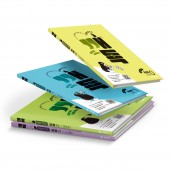
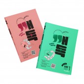
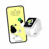
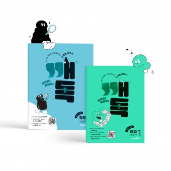
| DESIGN NAME: Ggaedok PRIMARY FUNCTION: Study Supplement INSPIRATION: Quotation marks which have the similar shape with the Korean consonant and vowel in GGAEDOK were used in the logo graphic to show the characteristic of Korean and to be interestingly expressed. UNIQUE PROPERTIES / PROJECT DESCRIPTION: The design of GGAEDOK was made with the combination of the brand name GGAEDOK which is an acronym of GGAEWOOJA DOKHAERYUK that is meant to awake the confidence and reading comprehension ability in Korean and the quotation marks to present the visual wit and the intuitiveness the definition of brand and characteristic as a study supplement for Korean. The characters appear in the vocabulary book and the reading comprehension book each in order to provide fun factors to the students. OPERATION / FLOW / INTERACTION: Brand identity was established with the utilization of quotation marks and it can be expanded with the logo or individually to be used as the graphic motif The growing character was visually expressed to match the brand concept which is a study supplement with incremental levels PROJECT DURATION AND LOCATION: The project was from August, 2022 to November, 2022 at MiraeN main office in Seoul and was published in November, 2022 |
PRODUCTION / REALIZATION TECHNOLOGY: Color foils were used on the respective and important parts of the quotation marks that were used in the logo for the enhanced visibility and the harmonious look with other letters. Particular color foils were designated by books in accordance with Pantone colors and the books were matte coated to maximize the effect of the color foil. SPECIFICATIONS / TECHNICAL PROPERTIES: Reading Comprehension Frame 220 x 280 x 10mm Post Processing glossy foil, half matte foil Color PANTONE 393C, PANTONE 310C, PANTONE 374C, PANTONE 529C Vocabulary Frame 188 x 257 x 11mm Post Processing glossy foil, half matte foil Color PANTONE 3385C, PANTONE 3572C TAGS: Education, Print, Design, Branding RESEARCH ABSTRACT: Visual creativity was sought after along with the intuitiveness to show the proper characteristic of (study contents) the book as a newly published book. Logo design that could be expanded to a graphic motif was sought after instead of just a logo. Character of Mulreong was created with the cooperation with 52works to provide entertainment and expectation to the students who have hard time studying due to the raised level of difficulty in Korean on Korean SAT CHALLENGE: It was carefully discussed how to get attention from the students since it is a new book without any brand recognition. Use of the quotation mark in the logo was carefully implemented graphically to avoid the clash with other letters so that GGAEDOK would be well read. ADDED DATE: 2023-02-13 09:13:04 TEAM MEMBERS (5) : MiraeN design team, Creative Director Hyunji Son, Brand Design Kiwook Kim, Danbi Kim, Media Design Seyoung Hong and Illustrator 52works IMAGE CREDITS: Miraen Design Team, 2022. |
||||
| Visit the following page to learn more: http://www.mirae-n.com | |||||
| AWARD DETAILS | |
 |
Ggaedok Study Supplement by Miraen Design Team is Winner in Education, Teaching Aid and Training Content Design Category, 2022 - 2023.· Press Members: Login or Register to request an exclusive interview with Miraen Design Team. · Click here to register inorder to view the profile and other works by Miraen Design Team. |
| SOCIAL |
| + Add to Likes / Favorites | Send to My Email | Comment | Testimonials | View Press-Release | Press Kit |

