Essence of 220 Years of the Library Exhibition by Maria Gazdag |
Home > Winners > #148235 |
 |
|
||||
| DESIGN DETAILS | |||||
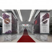
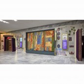
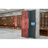
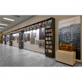
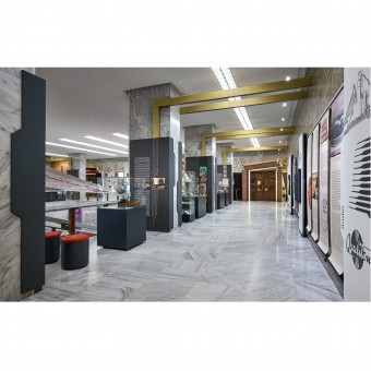
| DESIGN NAME: Essence of 220 Years of the Library PRIMARY FUNCTION: Exhibition INSPIRATION: Essence, Esszencia in Hungarian, was dedicated to celebrate the 22Oth anniversary of the founding of the National Szechenyi Library. In 18O2 Count Szechenyi transformed his private library into a Hungarika collection, thus laying the foundations of the Hungarian National Library. The story told also recalls the Corvina Library of king Matthias as it can be considered a historical predecessor. The curators of Essence targeted to present the complexity and multi layered nature of the more than ten million documents. These aspects were to be presented in an integrated educational exhibition in the common area of the building. UNIQUE PROPERTIES / PROJECT DESCRIPTION: The exhibition and the new corporate identity created for the anniversary are interlocked, playing important parts in shaping the library’s new image. The common areas of the working library are used by employees and readers as well as visitors. The library building is in the castle district with lots of tourists who are interested in what is being treasured in the impressive building. Therefore, the exhibition has to communicate to visitors with very different background knowledge. Complexity of the story and the diversity of the space called for flexibility in term of designing the exhibition elements. OPERATION / FLOW / INTERACTION: The space is rather fragmented. This disadvantage was turned to advantage by allocating the themes according to the space rather than forcing and changing the natural flow. The independently interpretable exhibition sections are linked together with a visual storyline creating an integrated story. Interactive screens provide more information and the experience of turning the pages of books treasured in the storages. At the sound terminals visitors can listen to old soundtracks or to present-day guardians of the collection talking about some treasures kept in the library. PROJECT DURATION AND LOCATION: Designing the first stage of the project started in January 2022, the second stage was completed on site by 26. November 2022. National Szechenyi Library Budapest, Hungary FITS BEST INTO CATEGORY: Interior Space and Exhibition Design |
PRODUCTION / REALIZATION TECHNOLOGY: Sustainability was an important aspect considered when planning to transform the large, empty, somewhat inhospitable marble cladded spaces. The aim was to use structural material as sparingly as possible, which also helps to keep the characteristics of the spaces. Changing high consuming light fittings and using new light fixtures with adjustable 4000K LED lights apart from reducing energy consumption helped to create a more hospitable ambiance. Reusing picture frames from the storages after giving them a new lease of life with new colours allowed to keep costs lower, and makes it easy to change content in the future. SPECIFICATIONS / TECHNICAL PROPERTIES: The brief was to utilize some 1300m2 of common area. The characteristics and functionality of the space used by the exhibition had to be kept intact. In most of the areas the exhibition elements had to be lined along the walls, not to change the functionality of the building. Overhead structures are used to tie areas together where content called for it. Some light effects were added but used sparingly not to change the ambiance of the library, and not to increase energy consumption unnecessarily. The aim was to create an environment which is exciting for exhibition visitors, but homely and warm for employees and readers. TAGS: cultural education, exhibition in a library, interactive exhibition, books, history RESEARCH ABSTRACT: To accompany the story, a visual storyline guides visitors through the exhibition. Hence is the citation of materials, techniques used to pass information to the readers throughout time. Vellum to digital surface, velvet to canvas, manuscript to printed texts etc. Lilac velvet comes from binding of Corvinas, deep red velvet from the binding of the founding charter, anthracite grey from canvas binding. Gold has been highlighting books from manuscripts to present-day editions. The new corporate identity and the interior are reflecting these historical aspects and forming a very strong new image of the institution. CHALLENGE: The diversified venue and content called for a design element to provide a link visually between the different contents. Nowadays libraries are working on moving their enormous content to the digital space, therefore, the old register cabinets, being distinct elements of libraries for a long time, are disappearing slowly. The catalogue tab used both in cabinets and on digital platform was implemented as a visual link, marking areas, framing content. This also reinforces the impression that these treasures are pulled out of the enormous collection hidden in the storages. ADDED DATE: 2023-02-10 19:38:13 TEAM MEMBERS (2) : Creative concept and exhibition design: Maria Gazdag and Graphic design: Tamas Takacs IMAGE CREDITS: Photographer: Gyorgy Darabos |
||||
| Visit the following page to learn more: http://bit.ly/3Kgj6Qr | |||||
| AWARD DETAILS | |
 |
Essence of 220 Years of The Library Exhibition by Maria Gazdag is Winner in Interior Space and Exhibition Design Category, 2022 - 2023.· Press Members: Login or Register to request an exclusive interview with Maria Gazdag. · Click here to register inorder to view the profile and other works by Maria Gazdag. |
| SOCIAL |
| + Add to Likes / Favorites | Send to My Email | Comment | Testimonials | View Press-Release | Press Kit | Translations |

