Victor Weiss Visual Identity by Victor Weiss |
Home > Winners > #147511 |
 |
|
||||
| DESIGN DETAILS | |||||
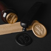
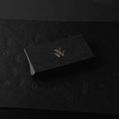
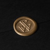
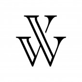
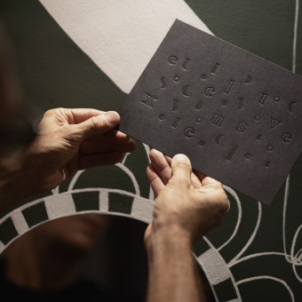
| DESIGN NAME: Victor Weiss PRIMARY FUNCTION: Visual Identity INSPIRATION: Victor Weiss Studio is a high-end internacional design agency. The target audiance is medium-small companies and people with high purchasing power. The studio usually undertakes one or maximum two projects at a time, in order to give the clients the full exclusive attention and capacity into delivering extream high level designs. The visual identity had have the exclusive look and feel. UNIQUE PROPERTIES / PROJECT DESCRIPTION: The brand identity was developed to inspire a high level of sophistication. Most of the studios projects are somewhat related to elegant, high class projects. The logo is a monogram with the combination of the letters V and W in a classy serif outlined fashion. The brand pattern was created by taking the letters of the slogan design "Be Exclusive." and spreading them out in a organic, almost random order. Playing with outlined and filled out properties. OPERATION / FLOW / INTERACTION: - PROJECT DURATION AND LOCATION: Victor Weiss Studio is based in Blumenau, a germanic colony city in South Brazil. The project iniciated in January 2020 and was launched in March 2020. FITS BEST INTO CATEGORY: Graphics, Illustration and Visual Communication Design |
PRODUCTION / REALIZATION TECHNOLOGY: - SPECIFICATIONS / TECHNICAL PROPERTIES: Business Card Format 8.5 x 5cm 2x0 colors, printed in letterpress + 1x0 colors, hot stamping Paper (Pop Set Black, 650g/m2) Printing (2x0 colors, letterpress + 1x0 colors, hot stamping) Wax seal custom signet + wax sticks 1 wax stick Handling and closing with wax + black envelope Postal format 23.5 x 17.1cm 1x0 colors, printed in letterpress Paper (Pop Set Black, 360g/m2) Envelope | Paper (Pop Set Black, 180g/m2) Printed in the letterpress system with platinum model machines (platten press), German manufacture, 1945. TAGS: Branding, Visual Identity, Exclusive, VictorWeiss, Graphic Design, Letterpress, Fine Printing, Elegant, Classy, High End, Logo, Monogram, Minimalism, RESEARCH ABSTRACT: The brand culture is to be organised and in control, leadership focused. The brand voice is lower speech, deep baritone. The brand experience is sophisticated, very professional and structured. The brand's archetype is The Ruler. The Ruler's purpose is to be a role model. Taking control and being motivated by maintaining high standards and priding itself on being a industry leader. They want to create an environment of prosperity, security and stability. They are a big believer that rules are meant to be kept and that policy and procedures are necessary to maintain order. CHALLENGE: How to standout in a world with millions of other design studios and designers? One word, exclusivity. To create a brand that people would be excited to work with, clients will feel that they are "lucky" to engage with. A company that hand-picks its projects, and maintains a incredible high level standard portfolio. The most complex task of the project was to express this visually. But with a combination of black, white, gold, fancy textures, custom fonts, a powerful slogan and extream minimalism we were able to create something that delivers exactly what was briefed in the early stages of the project. ADDED DATE: 2023-01-15 16:46:37 TEAM MEMBERS (1) : IMAGE CREDITS: Victor Weiss, 2022. |
||||
| Visit the following page to learn more: https://www.victorweiss.com.br/ | |||||
| AWARD DETAILS | |
 |
Victor Weiss Visual Identity by Victor Weiss is Winner in Graphics, Illustration and Visual Communication Design Category, 2022 - 2023.· Press Members: Login or Register to request an exclusive interview with Victor Weiss. · Click here to register inorder to view the profile and other works by Victor Weiss. |
| SOCIAL |
| + Add to Likes / Favorites | Send to My Email | Comment | Testimonials | View Press-Release | Press Kit |

