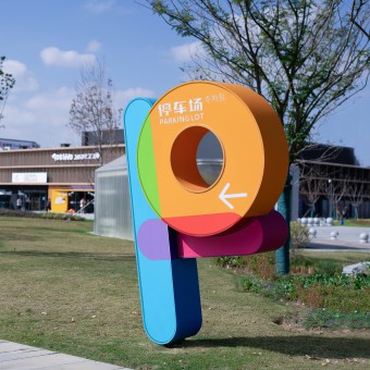
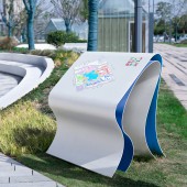
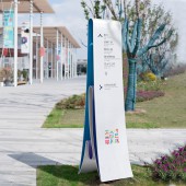
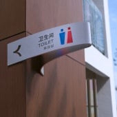
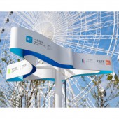
KK-Park Signage System by Yi Zhang |
Home > Winners > #147431 |
| CLIENT/STUDIO/BRAND DETAILS | |
 |
NAME: Value Design and Consulting (Shenzhen) Co., Ltd. PROFILE: Value Design and Consulting (Shenzhen) Co., Ltd. is mainly engaged in planning and design, architectural design and design research. We continue to pay attention to the essential value of the project, and take value as the starting point, construct the design logic, form the design method, propose solutions, and emphasize the realization and implementation of the design. "Look at urban resources from a new perspective and enhance urban values" is our core values. From the perspective of urban development, the degree of commercial sustainability of urban models, and the long-term protection of public interests, etc., gather cluster wisdom, conduct multi-dimensional and multi-disciplinary discussion and evaluation of projects, judge the relationship between the city and its architecture, environment, and operation, and then provide a viable design scheme for the city. |
| AWARD DETAILS | |
 |
Kk-Park Signage System by Yi Zhang is Winner in Graphics, Illustration and Visual Communication Design Category, 2022 - 2023.· Read the interview with designer Yi Zhang for design KK-Park here.· Press Members: Login or Register to request an exclusive interview with Yi Zhang. · Click here to register inorder to view the profile and other works by Yi Zhang. |
| SOCIAL |
| + Add to Likes / Favorites | Send to My Email | Comment | Testimonials | View Press-Release | Press Kit |
Did you like Yi Zhang's Graphic Design?
You will most likely enjoy other award winning graphic design as well.
Click here to view more Award Winning Graphic Design.


