Forshine Shenzhen Pavilion by Hong Wang |
Home > |
 |
|
||||
| DESIGN DETAILS | |||||
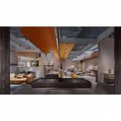
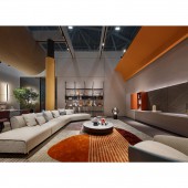
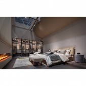
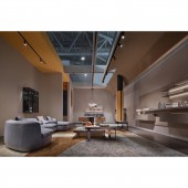
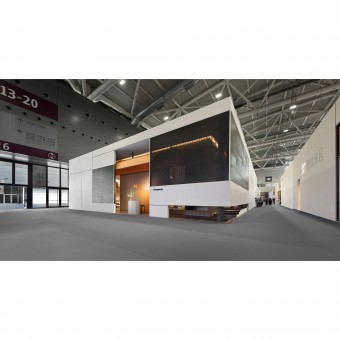
| DESIGN NAME: Forshine Shenzhen PRIMARY FUNCTION: Pavilion INSPIRATION: In the design of the project, the design team incorporated staggered and cascading geometric elements, aiming to give the viewer a sense of freedom and movement without restraint. This extreme charm adds flair and style to the space while setting off its corporate brand with a sense of vitality. UNIQUE PROPERTIES / PROJECT DESCRIPTION: This project is a pavilion space for FORSHINE at Shenzhen Home & Furniture Exhibition. With an area of 306 sqm, the design team wanted to create a new spatial structure within the framework of the building structure to build a richer field. OPERATION / FLOW / INTERACTION: In constructing the space, the design creates a sense of rhythm and rhyme through the interplay of curved blocks, staggered spatial structure and color flow. The interlocking and iterative placement of semi-arc blocks connects different spaces, making the transition interesting and layered, and allowing the space planning to show the wireless possibilities. PROJECT DURATION AND LOCATION: This project is FORSHINE's exhibition space installed in Shenzhen Home & Furniture Exhibition. Completed design and construction in 2021. FITS BEST INTO CATEGORY: Interior Space and Exhibition Design |
PRODUCTION / REALIZATION TECHNOLOGY: The showroom space also makes use of gardening techniques, setting the water feature inside to give the overall environment a proper sense of tranquility. The semi-permeable partition, the mirror reflection blurs the boundary of the whole field and overlaps with the "natural" spirit of the brand, which better accentuates the overall tone and atmosphere of the showroom.With the guidance of light and shadow and the gently floating surround passage into the exhibition area, the superposition of ceiling curves adds tension of light and shadow to the interior, superimposing the three-dimensional beauty of spatial sculpture. SPECIFICATIONS / TECHNICAL PROPERTIES: The exhibition space has an area of approximately 306m². TAGS: Pavilion,Gray,Warm,C RESEARCH ABSTRACT: As all the spaces of FORSHINE are concentrated in one volume, the interior space uses the circular shape as a link and guide in the air, forming an integral part with the building structure, creating an exploratory spatial form and a sense of rhythm, and becoming a medium of interaction between people and the exhibits. In order to create an immersive space experience and provide more possibilities for visitors to communicate with the showroom in depth, the layout uses a sunken area to create cohesion and a relaxed atmosphere, allowing the space to display its unique freedom with both enthusiasm and restraint. CHALLENGE: As a temporary space, the interior design uses curved shaped elements to add inclusiveness to the whole exhibition hall. In addition, the building blocks were prepared in advance to save time and cost for on-site construction and erection, and the façade of FORSHINE pavilion is composed of white composite panels and perforated panels, using simple lines to build a clean and sharp shape, while the black grid fabric makes the lights inside the building appear. ADDED DATE: 2023-01-09 12:47:44 TEAM MEMBERS (1) : Hong Wang IMAGE CREDITS: ZJ DESIGN LIMITED |
||||
| Visit the following page to learn more: https://youtu.be/ihUmQRnVzbU | |||||
| SOCIAL |
| + Add to Likes / Favorites | Send to My Email | Comment | Testimonials | View Press-Release | Press Kit |
Did you like Hong Wang's Trade Show Design?
You will most likely enjoy other award winning trade show design as well.
Click here to view more Award Winning Trade Show Design.


