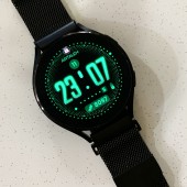
Cyber Element Smartwatch Face by Alex Pan Yong |
Home > Winners > #145571 |
 |
|
||||
| DESIGN DETAILS | |||||
| DESIGN NAME: Cyber Element PRIMARY FUNCTION: Smartwatch Face INSPIRATION: I aim to create a cyberpunk-style watch design that breaks away from the conventional approach of cramming all sorts of information onto the watch face. Unlike most cyberpunk designs, which tend to feature tiny, unreadable text and numbers, I want to create a design that prioritizes readability and clarity. Instead of packing the design with an excessive amount of information, I intend to create a clean and easy-to-read layout that incorporates elements of the cyberpunk style. UNIQUE PROPERTIES / PROJECT DESCRIPTION: This cyberpunk-inspired watch face boasts a sleek and readable design. Large, easy-to-read numbers make telling time a breeze, while the unique dial layout ensures that information on battery life, date, and daily steps is readily available. Despite its minimalistic appearance, this watch face still manages to provide all the necessary information in a quick and efficient manner, making it an ideal choice for those who value both style and functionality. OPERATION / FLOW / INTERACTION: This watch face is currently in the WatchMaker version, tap the small dot at the left lower corner (below hour) to change the 12/24 mode. Tap and hold to choose the colour theme (native WatchMaker colour palette) PROJECT DURATION AND LOCATION: The project started and finished in September 2022 in Singapore. FITS BEST INTO CATEGORY: Interface, Interaction and User Experience Design |
PRODUCTION / REALIZATION TECHNOLOGY: The actual product is currently in the WatchMaker version. It can be downloaded from the WatchMaker app and synced into your smartwatch (the WatchMaker app is needed on your watch). SPECIFICATIONS / TECHNICAL PROPERTIES: The dimension of this design is 512 x 512px on Android watch, 400 x 400px on Samsung watch. It supports both round and square smartwatches. TAGS: futuristic, business, casual, informative, glow, cyberpunk RESEARCH ABSTRACT: I want it to be in a cyberpunk style, a sense of future, while it still has a very high readability. So I decided to make the time much more dominant, and added visual variation on the font. The upper half of the font is in solid stroke while the lower half fades into the pattern of dots. It gives a kind of digital yet also cyberpunk feeling. Below the time text, it’s the day-in-week indicator which uses only the first letter of the day, e.g, “M” for Monday. Besides, this indicator itself plays the role of divider. Its layout forms the feeling of a line, helping to cut the whole watch face into two areas, the time & date area and the information area. When the day-in-week indicator plays the role of both info provider and space divider, there is no need for any more extra elements to be there to occupy extra space. In such layout, the preciseness of the dial is guaranteed, and the user can easily be focused on what really need. CHALLENGE: One must devise a strategy to arrange the information indicators in a manner that eliminates superfluous elements and ensures the dial is neat and accurate. In doing so, it is important to utilize the dots as a primary element to evoke a sense of cyberpunk. ADDED DATE: 2022-09-30 13:28:07 TEAM MEMBERS (1) : IMAGE CREDITS: Image #1: Photographer Pan Yong, Main image, 2023. Image #2: Photographer Pan Yong, Single shot, 2023. Image #3: Photographer Pan Yong, Single shot, 2023. Image #4: Photographer Pan Yong, Single shot, 2023. Image #5: Photographer Pan Yong, Single shot, 2023. PATENTS/COPYRIGHTS: Copyrights belong to Alex Pan Yong, 2023. |
||||
| Visit the following page to learn more: http://getwatchmaker.com/user/rkNWTgZJb | |||||
| AWARD DETAILS | |
 |
Cyber Element Smartwatch Face by Alex Pan Yong is Winner in Interface, Interaction and User Experience Design Category, 2022 - 2023.· Read the interview with designer Alex Pan Yong for design Cyber Element here.· Press Members: Login or Register to request an exclusive interview with Alex Pan Yong. · Click here to register inorder to view the profile and other works by Alex Pan Yong. |
| SOCIAL |
| + Add to Likes / Favorites | Send to My Email | Comment | Testimonials | View Press-Release | Press Kit |
Did you like Alex Pan Yong's Interface Design?
You will most likely enjoy other award winning interface design as well.
Click here to view more Award Winning Interface Design.


