DESIGN NAME:
Cozy Moment
PRIMARY FUNCTION:
Dentist
INSPIRATION:
It is the second collaboration between the designer and the client. The project is a pediatric dental clinic, which requires sufficient space for consultation and planning to avoid injuries to the children. At the same time, the designer has to arrange a suitable route and then present a comfortable and quiet atmosphere according to the client's needs. The designer combines resort and leisure elements with details as highlights to create a clean, bright, yet functional space.
UNIQUE PROPERTIES / PROJECT DESCRIPTION:
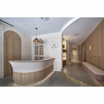
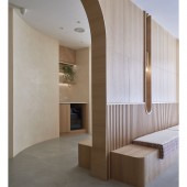
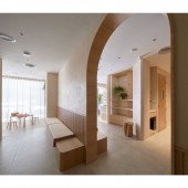
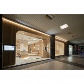
Soft Arcs. Upon entering, there are two counters and a waiting area outlined by arcs. The ceiling and floor of the waiting area have been improved to preserve the original conditions of the space. Through the staircase planning, the waiting area becomes a place for rest of mind. Raw Elements
Laminates and furniture are presented with raw and rustic elements such as rattan and wood, which can express the originality of the space and provide a variety of visual effects.
OPERATION / FLOW / INTERACTION:
A counter is a place where the staff spends a lot of time, so it is important to meet the height, ergonomics, spaciousness, and sufficient storage capacity. Moreover, the arc design, wood grain, and rattan that can be seen in the counter area are the key points of the whole space. Therefore, the counter becomes a visual highlight that impresses the visitors. The designer plans a children's playroom. Parents can watch their children interact with each other in the comfortable and spacious waiting area.
PROJECT DURATION AND LOCATION:
The project started in July 2022 and finished in October 2022 in Taipei City, Taiwan.
FITS BEST INTO CATEGORY:
Interior Space and Exhibition Design
|
PRODUCTION / REALIZATION TECHNOLOGY:
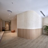
Building materials: grille, wood grain, mineral paint, tile, rattan, terrazzo, baking paint, 3M Glass Finishes Gradation, glass, etc. The designer differentiates the lines in the details by using different techniques of piecing them together. For example, the wood grain is pieced with herringbone or vertical piecing, while the large areas are painted with matte paints. The softness of the hand-painting texture gives the surface a beach-like, silky finish a resort-style.
SPECIFICATIONS / TECHNICAL PROPERTIES:
The project is a 161.9-square-meter pre-owned storefront with four clinics, a sterilization room, an X-ray room, a counter area, a waiting area, and a children's playroom. Without altering the original structure, the designer keeps the circular layout as a waiting area. The curvature of the ceiling and floor allows for a natural division of the area. Each area is connected by curved windows, but the arches create an interesting division.
TAGS:
Dental clinic, resort style, wood, rattan, light colors, arcs.
RESEARCH ABSTRACT:
The counter gathers all the design elements in the project and becomes a focal point between the paths. Next, the circular staircase in the waiting area highlights the original layout. Then, the children's playroom is fresh and bright, and the division of the arches creates an exciting interrelationship between the spaces. At the same time, the arc design echoes the resort style. Each area has a subtle distance from the other, and the non-partitioned layout does not affect the clinic's function.
CHALLENGE:
The challenge of the project is the presentation of the style. Since there are no resort-like clinics for reference, the designer has to start from scratch to retrieve reference elements. In the end, the designer consolidates three points: uncomplicated design, visual comfort, and a minimalistic color palette. The core of the design is to know how to adjust and change the building materials flexibly without multiple selections.
ADDED DATE:
2022-09-30 03:10:57
TEAM MEMBERS (1) :
PAO-CHIEH CHOU
IMAGE CREDITS:
Lin Fu Ming
|
