DESIGN NAME:
Life Live
PRIMARY FUNCTION:
Residence
INSPIRATION:
The project is completed with the growth of the client's children. From swaddling to learning to crawl, vitality can be seen. The design team used large color blocks to create a modern style, with attention to detail and transparency. In addition, the client wanted to avoid direct access to the kitchen from the foyer and needed plenty of space to store the baby's belongings to convey the spirit of 'home as life, life as home'.
UNIQUE PROPERTIES / PROJECT DESCRIPTION:
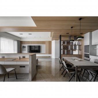
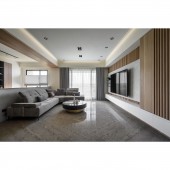
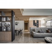
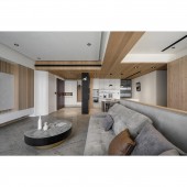
In the modern space, the design team preserved the natural light and scenery of the upper floors with penetrating designs and breaks at visual stops. Penetrative designs can be found in cabinets, grilles, ceiling heights, etc. Cabinets and grilles allow for a depth of field in the environment. In the public area, the grey tone creates a harmonious visual expression by linking the height differences in the space. In this way, the floor-to-ceiling effect is extended and amplified and is complemented by the light from the floor-to-ceiling windows.
OPERATION / FLOW / INTERACTION:
The project is the outcome of continuous communication and consensus building between the design team and the client to achieve the client's ideal 'look of home'. The design team installed storage cabinets in each area and created a Japanese modern mix of grey tones to suit the function and style.
PROJECT DURATION AND LOCATION:
The project finished in September 2021 in Taiwan.
FITS BEST INTO CATEGORY:
Interior Space and Exhibition Design
|
PRODUCTION / REALIZATION TECHNOLOGY:
Building materials: KD veneers, grilles, white and grey system panels, woodwork veneers, eco-friendly paints, aluminum frames, glass, baking paint, etc. This project was a space that had been left unused for over 5 years. The design team met the client's needs for a modern Japanese style and polished the original flooring to reduce the cost of additional materials.
SPECIFICATIONS / TECHNICAL PROPERTIES:
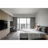
The project is a pre-owned apartment on the 16th floor. It has a total area of 102.4 square meters, with 3 plus 1 rooms, a living room, and a dining room. The layout focuses on preserving natural lighting. The public area is in a non-partitioned plan, with storage cabinets on the facade to meet the client's needs. In the private area, a sliding wooden door is installed in conjunction with the TV, allowing the wall to be moved flexibly. This not only avoids the common Chinese Feng-Shui problem but also allows for the positioning of beams above and flexible use of the facade for storage.
TAGS:
Higher floor, mixed style, Japanese, modern, grey tones.
RESEARCH ABSTRACT:
The project is decorated with the client's favorite wood grain and some dark color blocks, creating a unique design that mixes Japanese and modern. At the same time, the openwork cabinet makes the space look more delicate. The fresh wood grain with different colors can eliminate shortcomings and amplify the advantages of the space. The dark color of the facade can provide a visual focus for the space, while the light color of the wood grain can solve the oppressive feeling of the beam.
CHALLENGE:
The 16-story building has large and low columns. Plus, the position of the electrical box on the TV wall. These two points had to be properly planned in the layout, otherwise, it would have been a waste of space. The design team took a penetrating design to give the interior a heightened and enlarged feel. Moreover, the storage cabinets are positioned in the electrical box, so that the entrance door can be opened to reveal the penetrating cabinets. Finally, the storage cabinets and the TV wall are aesthetically shaped with a breakpoint to give the space its most natural look.
ADDED DATE:
2022-09-28 07:41:57
TEAM MEMBERS (1) :
yhousedesign
IMAGE CREDITS:
Fan-Yu Shen, Wu Zoey
|
