DESIGN NAME:
Less is More
PRIMARY FUNCTION:
Residential
INSPIRATION:
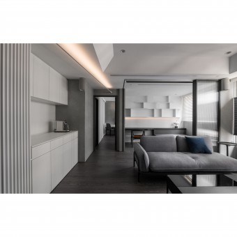
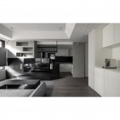
Instead of complex design elements, the interweaving of black and white conveys a pure sense of space to release the homeowners’ fatigue when they come back from the high-pressure workplace. The stable ink color creates a sense of visual weight. Like a cool calming breath of fresh air, white has a light, airy feel. The neutral grayscale paint, horizontally extended steel linear lamps, and the contrast between black and white build a peaceful and harmonious living scene.
UNIQUE PROPERTIES / PROJECT DESCRIPTION:
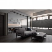
The ink-colored main wall and the white cabinets provide a high contrast look, while the gray hand-applied texture on two sides adds a rustic atmosphere to balance out a bold black and white color palette and bring a personalized touch to the main scene. The TV wall is designed with dark tones. Dark colors make the TV wall recede to the background and visually expand the space.
OPERATION / FLOW / INTERACTION:
Upon opening the door, the grayscale coating of faux fair-faced concrete covers the entrance. The hand-brushed traces reveal a gentle and elegant humanistic texture, while the narrow corridor is reflected in the mirror to add depth to the space. The tranquil and stress-free atmosphere in the field brings peace to the mind and soul gradually.
The changes of flooring materials lead to the public area. The open floor plan creates an unobstructed visual line, and the beveled edges on the ink-colored TV wall soften the rigidity of sharp corners. Besides, the lower TV cabinet is beveled from the outside to the inside to create a focal point. The geometric assemblage creates the impression of a stable but not heavy main wall.
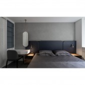
Upon entering the bedroom, the irregular special lacquer on the wall behind the bed is hand-painted to implant the warmth from the craftsman. The deep ocean blue headboard continues to add a touch of serenity to the atmosphere. In the gray and white field, the gold-framed mirror is hung on the canopy, which nimbly infuses an inviting and luxurious vibe to the space.
PROJECT DURATION AND LOCATION:
The project is finished in July 2022 in Taoyuan City, Taiwan.
FITS BEST INTO CATEGORY:
Interior Space and Exhibition Design
|
PRODUCTION / REALIZATION TECHNOLOGY:
Iron parts, matte black glass, leather, metal laminate hard plastic sheet, raw concrete
SPECIFICATIONS / TECHNICAL PROPERTIES:
The 56 square meters limited residence features an open kitchen. The solid wall between the living room and kitchen is replaced by a half-height TV wall, which divides the spaces. In this space there are an entrance, one living room, one dining room, one kitchen, one study room, one bedrooms and two bathrooms.
TAGS:
Interior Design, Modern style, Black and white, Hand-applied texture, Open floor plan
RESEARCH ABSTRACT:
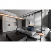
The purity of black, gray and white combined with the simplicity of the lines build a stable living scene. The white light sprinkles lightly in a less colored palette. The light bounces around and gently adds elegant touches to the room so that residents can leave the neon streets of the city behind and immerse themselves in this uncluttered residence. The partition wall between the living room and study room is replaced by a sliding glass door, which provides a generous visual depth. The glass keeps the room transparent while also providing an independent space. The study room is enclosed by reeded glass. Thanks to its ability to partially obscure what's behind it, reeded glass can provide privacy. The elevated couch with ample storage space below is a practical solution for the small space dwellers that need to accommodate overnight guests.
CHALLENGE:
Since the homeowners are tall, a framed canopy in the public area enhances the sense of vision. The beveled extension echoes the main TV wall. In the space that features gray, black and white tones, the wooden flooring provides comfort and warmth. The extra wide panels reduce the dividing lines and make the view more compact. In order to smooth out the bumpy surfaces, the TV wall serves as the base surface and the pipe room is wrapped with the coating upward. Moreover, the wall is recessed slightly to form a display platform.
ADDED DATE:
2022-09-28 06:09:04
TEAM MEMBERS (1) :
Handy Kuo
IMAGE CREDITS:
HANDEEP.C Design
|
