Weingut Waalem Brand Identity by Jorg Stauvermann |
Home > Winners > #145095 |
 |
|
||||
| DESIGN DETAILS | |||||
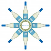
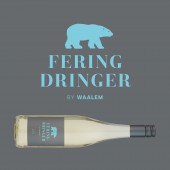
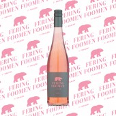
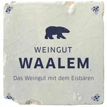
| DESIGN NAME: Weingut Waalem PRIMARY FUNCTION: Brand Identity INSPIRATION: Constant sea breezes, harsh North Sea climate and a vineyard in the heart of the mudflats. To begin with, it was by experiment that the passionate, proud Frisians on the island of Foehr, in the midst of the stormy Sea, began cultivating wine. The basis for the corporate design is based entirely on the architecture of the winery and the landscape of the island. Both the historical tiles as godfathers of the seafaring history of the island and the colors of nature characterize the appearance. UNIQUE PROPERTIES / PROJECT DESCRIPTION: Climate change has had an impact on wine growing on the island of Foehr in the middle of the Wadden Sea. The polar bear is the symbol of climate change. It implies intelligence, fearlessness and perseverance. Just like the Frisians on the island of Foehr. The graphic reduction of the 2022 relaunch enables a stronger focus on the growing product range. The square format - borrowed from the tiles of the captain's houses - is retained. Likewise the constant reference to the island. OPERATION / FLOW / INTERACTION: The vinery Waalem produces its own alcoholic beverages such as wine, sparkling wine or spirits. These products are particularly popular with guests on the island. But even among the islanders, the polar bear is now a symbol of the highest quality. Drink responsibly. PROJECT DURATION AND LOCATION: The vinery Weingut Waalem was founded in 2009. The redesign of the brand identity started in 2021. FITS BEST INTO CATEGORY: Graphics, Illustration and Visual Communication Design |
PRODUCTION / REALIZATION TECHNOLOGY: The corporate design is typographically characterized by the house typeface Clan. Depending on the application, there are different spacing and mathematically defined line spacing depending on the font size. The historic Revista font family is used for all wine-based products. The modern interpretation of the fracture Rostrot for all spirits. SPECIFICATIONS / TECHNICAL PROPERTIES: All bottles : 0,75 l TAGS: Brand identity, Corporate Design, Historical tiles, Illustration, Island Foehr, North Sea, Polar bear, Weingut Waalem RESEARCH ABSTRACT: The island's history is closely linked to seafaring since the 16th century. The structure of the villages, the stories of the families, the buildings and also the nature bear witness to the seafaring traditions. The design of the winery is a contemporary reference to all of these things. CHALLENGE: The research on the individual captains of the island was particularly time-consuming when developing the stories about the spirits. Since there are not pictures of all captains and their ships, it went deep down into the archives of northern European seafaring history. ADDED DATE: 2022-09-27 14:04:29 TEAM MEMBERS (1) : IMAGE CREDITS: Main Image Name : ADA_Weingut-Waalem_Main Image Creation, Illustration : Jörg Stauvermann Photography : Axel Rauterberg Optional Image 1 Name : ADA_Weingut-Waalem_Optional Image_1 Creation, Illustration : Jörg Stauvermann Photography : Axel Rauterberg Optional image 2 Name : ADA_Weingut-Waalem_Optional Image_2 Creation, Illustration : Jörg Stauvermann Photography : Axel Rauterberg Optional image 3 Name : ADA_Weingut-Waalem_Optional Image_3 Creation, Illustration : Jörg Stauvermann Photography : Axel Rauterberg Optional image 4 Name : ADA_Weingut-Waalem_Optional Image_4 Creation, Illustration : Jörg Stauvermann Photography : Thorsten Schmidtkord, Axel Rauterberg |
||||
| Visit the following page to learn more: http://bit.ly/3DlSWXe | |||||
| AWARD DETAILS | |
 |
Weingut Waalem Brand Identity by Jorg Stauvermann is Winner in Graphics, Illustration and Visual Communication Design Category, 2022 - 2023.· Press Members: Login or Register to request an exclusive interview with Jorg Stauvermann. · Click here to register inorder to view the profile and other works by Jorg Stauvermann. |
| SOCIAL |
| + Add to Likes / Favorites | Send to My Email | Comment | Testimonials | View Press-Release | Press Kit |
| COMMENTS | ||||||||||||
|
||||||||||||

