DESIGN NAME: Mizone Zero
PRIMARY FUNCTION: Beverage Packaging
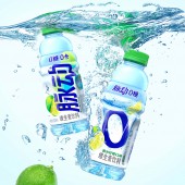
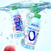
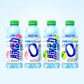
INSPIRATION: Based on the desk research about zero sugar market, the team found out that 0 icon is widely used within category. Thus, a giant number "0" becomes the most outstanding key graphic element on back side to represent the key selling proposition of "zero sugar". Delicious fruits and number "0" fall into the water, throwing up tall plumes of spray. This impactful key visual gives the consumers a hydration feeling and taste imagination. The color of white and watery blue also makes the package more refreshing. Get this product, then consumers can enjoy a burden free journey with the sour-sweet lemon and sweet white peach by Mizone Zero Sugar.
UNIQUE PROPERTIES / PROJECT DESCRIPTION: With the rising awareness of health concern in China, zero sugar beverage becomes a trend in China market. The design upgrade of Mizone Zero aims to better deliver the concept of "Mizone Zero Sugar" and make it more distinctive from the core line, while providing consumers a better product experience.
OPERATION / FLOW / INTERACTION: To stand out among zero sugar products, it is important to create an outstanding visual of Zero Sugar concept. Therefore, the idea of number "0" falling into the water comes to mind. The tall plumes of spray remind consumers of the refreshing taste and bring cool feeling.
PROJECT DURATION AND LOCATION: Project starts in July, 2022 and launches in March, 2023.
FITS BEST INTO CATEGORY: Packaging Design
|
PRODUCTION / REALIZATION TECHNOLOGY: PET bottle covered with shrink film
SPECIFICATIONS / TECHNICAL PROPERTIES: Width 7cm x Height 21cm
TAGS: Packaging, zero sugar, beverager, Mizone, China
RESEARCH ABSTRACT: Based on desk research, the team found out that zero sugar beverage has its own design code. For example, black, silver and light blue are selected for font. The fruit flavor color is more refreshing and mild. 0 can be either combined with logo or becomes an individual visual hammer. The tonality is more refreshing and simpler. After combining these principles with Mizone's production limitation, the final design uses a big 0 visual hammer to reinforce its attribute and the Mizone logo becomes black.
CHALLENGE: The most challenge part of this project is how to realize water wave on production. This label is transparent and the bottle is light blue. With several rounds of adjustment on FA and the help of production factory, the result turns to be good.
ADDED DATE: 2022-08-08 11:02:54
TEAM MEMBERS (7) : Creative Director: Yang LI, Art Director: Chaojie WANG, Senior Designer: Bo WANG, 3D Rendering: Sheng WAN, Senior Account Executive: Yufan WANG, Managing Director: Lei ZHANG and
IMAGE CREDITS: Blackandgold Design (Shanghai) Co., Ltd.
|