The Zlin Region Brand and Visual Identity by Radoslav Dostal |
Home > Winners > #142959 |
 |
|
||||
| DESIGN DETAILS | |||||
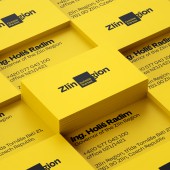
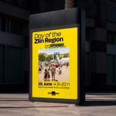
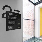
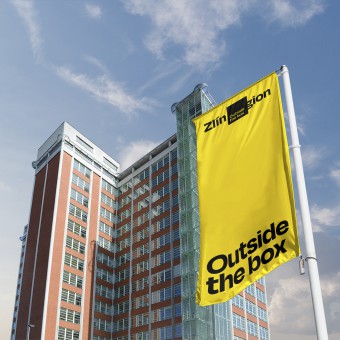
| DESIGN NAME: The Zlin Region PRIMARY FUNCTION: Brand and Visual Identity INSPIRATION: The turbulent times we live in, technology driven changes, plus ever evolving Zlin, all are inspirations for the project. The Czech Henry Ford, Tomas Bata the visionary, is a catalyst and totem with his saying What you want, you can. Of course, the region's inhabitants too, as their creativity enables emancipation from self imposed mental borders. Geographic frontiers are also motivations, with the square's four corners representing Zlin's four historical districts. UNIQUE PROPERTIES / PROJECT DESCRIPTION: The design dispenses carefully crafted brand DNA and essence of Live Creative Spirit to reinterpret the phrase Outside The Box. This manifests through a complex square-based visual identity, portraying a philosophical dichotomy of self imposed limits and unrestricted possibilities. A Region Without Borders symbolising Zlin's creative and entrepreneurial spirit, ambition, worldliness and courage. Where the region's creativity breaks out beyond a boxed in comfort zone and our own shadows. OPERATION / FLOW / INTERACTION: The design transforms perceptions and conceptions of Zlin. Positioning the region away from Prague's periphery, towards a new horizon of creativity and innovation. These characteristics are inherent to the region, and can now be exported through its inhabitants, as they interact and break through the four walls, in a physical and metaphorical sense. The square performs as their base, providing the foundation for communicating the brand's values of acting, thinking and living Outside The Box. PROJECT DURATION AND LOCATION: The project started in 2021, when the government decided it needed a rebrand. The project finished in 2022. FITS BEST INTO CATEGORY: Graphics, Illustration and Visual Communication Design |
PRODUCTION / REALIZATION TECHNOLOGY: The design and methodologies disrupt traditional Czech regional branding styles. The square's edges represent natural roots, anchoring and framing, while denoting where transformation happens. A creative cube defying corners, recast as a box growing beyond imagined and actual borders. Amid the primary colours black, white, dark yellow, light yellow. Yellow is a reverential nod to Zlin's traditional hue. Covering part of the word Zlinsky emphasises the iconoclasm of the design and region. SPECIFICATIONS / TECHNICAL PROPERTIES: Digital TAGS: Zlin, Czech Republic, creativity, borders, square, architecture, DNA, change, openness, RESEARCH ABSTRACT: The project started by examining Zlin's history and its visionaries. Among these, Tomas Bata, one of the world's biggest footwear manufacturers and retailers. Analysing his and others successes formed the basis for the brand essence of Live Creative Spirit. Discussions with the Regional Governor uncovered a disconnect between the region's youth and the area and government. This inspired the logo design to be as a visual disruptor, defying pigeonholes and inspiring creativity. CHALLENGE: Perhaps the hardest challenge was to overcome the region's recent history. A declining population had been leaking talent to Prague. Existing branding had been hampered by a traditionally dry and dull approach. This presented challenges when it came to reframing historical and social perspectives. Faced with these obstacles, it was a strategic and creative decision to go bold with the branding, breaking out from the constraints of the past. ADDED DATE: 2022-06-30 15:55:14 TEAM MEMBERS (4) : Strategy: Zuzana Behova, Jan Blazek, Creative Director: Tomas Nedved, Art Director: Radoslav Dostal and Graphic Designer: Milan Nguyen IMAGE CREDITS: Photographer Julius Filip Film maker Radim Vanous |
||||
| Visit the following page to learn more: http://littlegreta.co.uk | |||||
| AWARD DETAILS | |
 |
The Zlin Region Brand and Visual Identity by Radoslav Dostal is Winner in Graphics, Illustration and Visual Communication Design Category, 2022 - 2023.· Press Members: Login or Register to request an exclusive interview with Radoslav Dostal. · Click here to register inorder to view the profile and other works by Radoslav Dostal. |
| SOCIAL |
| + Add to Likes / Favorites | Send to My Email | Comment | Testimonials | View Press-Release | Press Kit |


