Waterway School Library by Design Action |
Home > Winners > #142898 |
 |
|
||||
| DESIGN DETAILS | |||||
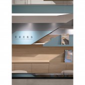
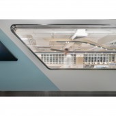
| DESIGN NAME: Waterway PRIMARY FUNCTION: School Library INSPIRATION: This project is on the Lantau Island. The island is surrounded by sea with tremendous nature landscape. In densely populated Hong Kong, it is rare to have a good balance of high-rise residence and nature. The designer hopes this project links to this unique geographical environment. The main colors of the library are sea blue, cement and wood. They symbolize reading as a sea that nurture the concrete structured city, natural landscape, and a peaceful, relaxing experience. UNIQUE PROPERTIES / PROJECT DESCRIPTION: The library is ship full of knowledge, good learning atmosphere is a breeze that leads the students sail to their destinations. Getting knowledge helps the students find a breakthrough to their study or develop other skills. The designer would like to create a relaxing, self-paced study space, which attracts them to stay behind after classes and fall in love with knowledge. OPERATION / FLOW / INTERACTION: Once enter the library, the borrowing desk and bookshelf are in the sight, with a hanging book recommendation on top of the shelf. This setting makes it easier to interact between the librarians and students, which might increase the borrowing rate. The stretch of the bookshelf is a set of staircase for student to sit and read. When the projector screen scrolls down, this staircase with the capacity of 30 people become a teaching area. Besides the staircase is self-study area. When students sit on the bar chair, they can admire the nature view outside the window. PROJECT DURATION AND LOCATION: The project finished in April 2022 in Ho Yu College and Primary School (Sponsored by Sik Sik Yuen), Hong Kong. FITS BEST INTO CATEGORY: Interior Space and Exhibition Design |
PRODUCTION / REALIZATION TECHNOLOGY: Plastic laminate, Vinyl sheet, Paint, Glass SPECIFICATIONS / TECHNICAL PROPERTIES: 3900 Sq.ft TAGS: Library, School, Educational, Waterway, Secondary School, Design Action, Ho Yu College and Primary School - Sponsored by Sik Sik Yuen RESEARCH ABSTRACT: The original spatial design was linear and classical, it feels strict and had low usage. The front desk was facing opposite side of the entrance and divided the bookshelves into two areas. This was inconvenient for the students, so it needs a huge change. In addition, the original setting felt closed and have a 2.4-meter-high suspended metal ceiling. The designer need to breakthrough this traditional structure, increase the book capacity and keep the air-conditioning system. To add more dimension on students learning experience and attract students to stay in the library. CHALLENGE: The designer used diagonal linear design as main axis, that changes the boring spatial design lively. When entering the library, the borrowing desk and new book display are in sight. This not only encourage interaction between students and librarians but increase the borrowing rate. On the other hand, the designer created an open and sharing concept for the planning to create a new feeling to attract students. ADDED DATE: 2022-06-30 10:44:28 TEAM MEMBERS (2) : Creative Director: Vincent Li and Designer: Mancy Li IMAGE CREDITS: Design Action PATENTS/COPYRIGHTS: Design Action |
||||
| Visit the following page to learn more: http://designaction.com.hk | |||||
| AWARD DETAILS | |
 |
Waterway School Library by Design Action is Winner in Interior Space and Exhibition Design Category, 2022 - 2023.· Press Members: Login or Register to request an exclusive interview with Design Action. · Click here to register inorder to view the profile and other works by Design Action. |
| SOCIAL |
| + Add to Likes / Favorites | Send to My Email | Comment | Testimonials | View Press-Release | Press Kit |


