DESIGN NAME:
White Yarn
PRIMARY FUNCTION:
Residential
INSPIRATION:
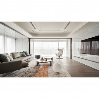
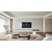
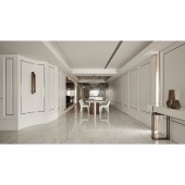
Like a beautiful bride dressed in a white veil, the space is designed with a beautiful white tone as the theme to connect the distant scenery of Daan District in Taipei. Under the brushstroke of white, the post-modern aesthetics of luxury and elegance are perfectly depicted. The soft lines in the details with European-style trims and the clear yet relaxing scene create a beautiful residence that is impressed in the heart of the client.
UNIQUE PROPERTIES / PROJECT DESCRIPTION:
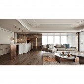
Given the natural lighting advantage of the space, the design goal is to harmonize the internal tone of the space to create a light and elegant atmosphere. The public area is white. The ceilings, walls, and even the furnishings are all beige and white. In addition, the design team also superimposed metallic lines as a framing configuration to create a faux antique mirror-like effect. The advantage of 'borrowed scenery' gives the space a more magnified feeling. At the same time, the design team used curved lines instead of square frames to make the twists and turns in each area more fluid and beautiful.
OPERATION / FLOW / INTERACTION:
In view of this, the space is designed with the client's preference for white. At the turn of the path, the vista is planned to provide a space for displaying artwork. Meanwhile, the design team used blank space to master the subtle changes in the colors by delicately overlapping materials. With the soft glow, natural lighting, curved outline, trims, and faux antique mirror, the result is an elegant space to complement the client's art collection.
PROJECT DURATION AND LOCATION:
The project finished in March 2021 in Taiwan.
FITS BEST INTO CATEGORY:
Interior Space and Exhibition Design
|
PRODUCTION / REALIZATION TECHNOLOGY:
Vista, metal lamp, tawny mirror, European style trims, modeling chandelier, faux antique mirror, marble, paint, large slab, marble, stone, planting.
SPECIFICATIONS / TECHNICAL PROPERTIES:
In the light-colored space, the design team used lines to delineate the landscape. Among them, the precise angle between the transition of each area and the material division is the highlight of the planning. It is necessary to minimize the division lines to enhance the smoothness of the transitions in the space. Both the aesthetics and the usability are greatly enhanced.
TAGS:
Fresh space, White tones, European classical, Post-modern, Micro luxury residence.
RESEARCH ABSTRACT:
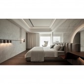
In the bright public area, the design team used wooden flooring to superimpose faux antique mirrors and bar tables. The curved line weakens the volume of the bar. The combination of natural light, mirrors, and curves creates a light and elegant atmosphere. Continuing the advantage of lighting, the design team retains the windows in the master bedroom and its bathroom to create a landscape for each member of the house to enjoy. The delicate concept of introducing scenery into the room is integrated with the understated and elegant interior design to create a more tranquil and relaxing experience.
CHALLENGE:
The design team was faced with the challenge of building height restrictions and low beams. Because of this, the design team used framing design and linear materials to highlight the space and used wood and marble on the flooring to complement the whole space. In addition, the design team also used the faux antique mirror to achieve the 'borrowed scenery' effect to inject an extended sense of the natural reflection of the material. Furthermore, the bedside space is not as wide as expected. The design team used a wrap-around design to enhance the route and efficiency of the space to show a smoother plan.
ADDED DATE:
2022-06-30 08:47:31
TEAM MEMBERS (1) :
PEI-TZU CHI, YUNG-CHENG YANG
IMAGE CREDITS:
WO GIANT INTERIOR DECORATION INDUSTRY Limited Company
|
