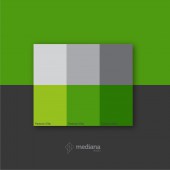
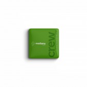
Mediana Studio Brand Identity by Manuel Ignacio Ruiz |
Home > Winners > #142415 |
| CLIENT/STUDIO/BRAND DETAILS | |
 |
NAME: Manuel Ruiz Design PROFILE: Manuel Ignacio Ruiz is a highly creative and multi-talented Graphic Designer/Art Director armed with more than 23 years verifiable success in areas of graphic design, identity projects, branding, advertising, entertainment, signage and industrial design. Well educated and equipped with exceptional collaborative and leadership skills leveraged at inspiring and leading teams to deliver projects on time and within budget. Recognized for consistently delivering work that is organized, intelligently designed, impactful and in alignment with operational requirement. Highly skilled in client and vendor relations and negotiations. Approachable, well presented and able to contribute immensely to the success of any organization within established standards, policies and procedures. |
| AWARD DETAILS | |
 |
Mediana Studio Brand Identity by Manuel Ignacio Ruiz is Winner in Graphics, Illustration and Visual Communication Design Category, 2022 - 2023.· Press Members: Login or Register to request an exclusive interview with Manuel Ignacio Ruiz. · Click here to register inorder to view the profile and other works by Manuel Ignacio Ruiz. |
| SOCIAL |
| + Add to Likes / Favorites | Send to My Email | Comment | Testimonials | View Press-Release | Press Kit | Translations |

