DESIGN NAME:
Humanistic Vision
PRIMARY FUNCTION:
Residential
INSPIRATION:
Frank Lloyd Wright, one of America's foremost architects, once said, "Architects have to listen to the original voice to some extent." But what is the original sound? We can say it is a sense of belonging to the user. Because functionality and aesthetics are satisfied, it creates a space where people can live in peace and happiness. We also see this state in the project. The designer combined the different aesthetic and usage needs of the male and female clients, blending the luxury and elegance style with the softness. With this, a gentle and stable living scenery is formed.
UNIQUE PROPERTIES / PROJECT DESCRIPTION:
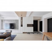
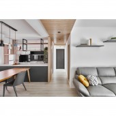
At the entrance, to harmonize the boldness of the iron-sand galvanized steel door, the designer laid hexagonal tiles in the dust area and framed a full-length mirror. Adopts an open kitchen design. At the same time, made the cabinets above the center island into a combination of iron hanging cabinets and small frames, eliminating the embarrassment of traditional doors blocking the view and creating oppression. The black ironwork also echoes the calm gray of the center island, making it the highlight of the space.
OPERATION / FLOW / INTERACTION:
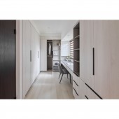
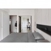
The designer connected the original master bedroom with the second bedroom, extending the space of the master bedroom and integrating the dressing room, study room, and guest room into this space. If guests are staying overnight, the clients can pull open the hidden sliding door embedded in the wall to make maximum use of the space. In this multifunctional space, the designer has noticed the lighting. Since the female client likes to do her makeup in natural light, the table was placed next to the window to meet her needs.
PROJECT DURATION AND LOCATION:
The project started in February 2021 and finished in June 2021 in Xizhi Dist., New Taipei City.
FITS BEST INTO CATEGORY:
Interior Space and Exhibition Design
|
PRODUCTION / REALIZATION TECHNOLOGY:
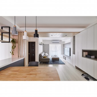
Because the male client likes cool colors such as gray, black, and white and the female client likes Scandinavian wood colors, the designer used different materials to match each other. The ceiling between the living room and the kitchen is covered with wood veneer, which not only makes the beams invisible but also separates the space. On the other hand, different from the traditional wood flooring, the flooring is made of stone plastic, so the color would not be too yellow but bright and mild.
SPECIFICATIONS / TECHNICAL PROPERTIES:
The size of this project is 76 square meters, the designer modified the layout of the original 3 bedrooms into 2 plus 1 bedroom, 2 bathrooms, and a living room and dining room. To create a well-lighting and quiet atmosphere, the designer used ingenious techniques such as integrating beams and columns with system cabinets or chamfer to soften the space. In this way, the shortcomings of the space are turned into advantages.
TAGS:
Old House Renovation, Tasteful Life, Composite space, The visual impact of warm and cold tones, New Life in Old House
RESEARCH ABSTRACT:
The designer renovated the apartment in a 23-year-old building. In order to create a space that meets the needs of both the clients and their children, it was necessary to create an open but private space in 76 square meters house. The designer used different materials to divide the space and then used black, white, gray, and wood to match each other. With white, gray, and black as the main colors, the wood texture becomes a soft and gentle mixer for the space, making the atmosphere less rigid and serving as a highlight. The charm of natural textures flows freely in the space, responding to people's desire for happiness.
CHALLENGE:
This project is an old house, the condition of the house had many parts that need to be repaired and renovated, such as partition walls and thin flooring. In addition, most of the exterior trim needs to be removed, so it is necessary to pay attention to the details during construction. Furthermore, it also faced the most troublesome problem for many designers, "low beams and many pipes." Meanwhile, the clients wanted to have open space with clear zoning. To deal with these, the designer must incorporate the beams and columns into the planning to minimize the bulky feeling.
ADDED DATE:
2022-06-22 05:30:27
TEAM MEMBERS (1) :
Tzu-Hsuan Liu
IMAGE CREDITS:
Pinhsu Design
|


