Flourishing Grandbuy Renovation of a Department Store by Hu Chen |
Home > Winners > #142024 |
 |
|
||||
| DESIGN DETAILS | |||||
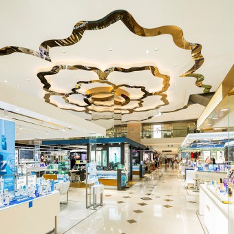
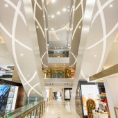
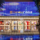
| DESIGN NAME: Flourishing Grandbuy PRIMARY FUNCTION: Renovation of a Department Store INSPIRATION: The renovation of a department store is a huge system that requires consideration of various aspects, but among which, the consumers' route, like the “blood vessel” of commercial spaces, plays the most essential role in the whole system. It is the inspiration and the core of our project. Following this “vessel”, we use spatial design techniques to reconstruct the consumers' route, so as to circulate consumers' flow, attract more consumers, and upgrade the brands to improve the store's revenues. UNIQUE PROPERTIES / PROJECT DESCRIPTION: Grandbuy is an old department store at a famous pedestrian street of Guangzhou, China. It included two buildings constructed in different time, which leads to a spatial misalignment in between. This impaired the consumers' experience and their revenues. The store was needed to be renovated. This design reconstructs the consumers' route, connecting the buildings as a whole in both spatial and business sides. On the reopening day after the renovation, the sales reach the highest peak of the year. OPERATION / FLOW / INTERACTION: This project was designed in the following 4 steps. Step1:Form a central axis and a core atrium to improve the holistic relationship between the new and old buildings to avoid spatial fragmentation to better circulate the in-store consumers’ route and enhance the visibility and accessibility of the shops. Step2:Add sightseeing new elevator and escalators to strengthen the vertical accessibility of each floor to eliminate cold business areas to attract more consumers and better fulfill their needs. Step3:Use visual design, including innovative expressions of cultural elements and commercial lighting design, at the two entrances where the consumers’ route start to highlight the presence of the Grandbuy Department Store and attract more consumers. Step4:Optimize the first floor brands according to the new consumers route to create the most influential and comprehensive cosmetic aggregation in South China. These steps allow the the Grandbuy department store, which consists of two buildings constructed in different time, become a whole, and become more fashionable and recognizable. The whole store was successfully ungraded and their annual sales were significantly increased. PROJECT DURATION AND LOCATION: The project was designed in March 2018, and was landed in September 2020. The project is now in use and perfectly operating. FITS BEST INTO CATEGORY: Interior Space and Exhibition Design |
PRODUCTION / REALIZATION TECHNOLOGY: My design is a renovation of a whole department store, thus countless materials and construction techniques were highly involved. Therefore, due to the characters limitation, in this part, I could only and I would like to choose one of the worth-mentioned materials to explain. At the east entrance of the department store, with side-by-side buildings nearby, we use the light weight aluminum plate with changeable color system and cast it into the tile shape of Guangzhou architecture, with illusion lighting and computer imaging RGB color LED lamp bead matrix to make the department store "jump out" within the side-by-side buildings. The materials we chose are not expensive, easy to maintain and effective. Practically speaking, we have fully taken economy, ease of use, safety and maintenance into account, it is sustainable. Aesthetically speaking, we interpreted traditional elements with modern techniques and used commercial lighting to beautify the entrance and make it become more attractive. SPECIFICATIONS / TECHNICAL PROPERTIES: Total Volume: 66300㎡ TAGS: Department Store Renovation, Department Store Design, Commercial Spacee Renovation, Commercial Space Design, Renovation Design, Interior Design, Interior Renovation, Consumers' Route design, Architectural Design, Facade Design RESEARCH ABSTRACT: Research Type: Department Store, Commercial Space Renovation Design Research Objectives: This project was given to us by our client. At the beginning, our client only knew that their department store property was too old to attract new consumers, which was affecting sales. Therefore, in order to be more competitive, they needed to renovate the property. By making various on-site research, business analysis, consumers' route analysis, and aesthetic research, we finally made "upgrading the consumers' route to improve " the objectives of our entire proposal. Methodology: On-site Research, Business Analysis, Human-centered Observation, Consumers' Route Analysis, Aesthetic Research, etc Results: By the optimization of the consumers' route, we also improve the cultural and aesthetic visual expression of the scene and the integrality and accessibility of the space, which finally successfully helped the department store upgrade and iterate, attracting more first-tier brands and significantly increasing sales. Impacts/Effects: After the renovation during the 2020 COVID-19 pandemic, the total sales exceeded 32.5 million RMB on the reopening day, which reach the highest peak of the whole year. And since then, this department store has become a new “must-go” place of more consumers. Economic speaking, this renovation project has boosted the sales of our client's business as well as boosted the local economy; environmental speaking, it reused the original scene to revive an old property, saving it from dereliction; socially speaking, it offers a greater place for people to relax, which enriches people's life. CHALLENGE: Before the renovation, the connection between the old and new buildings was obstructed, the outdoor image was weak, the indoor guidance was unclear, and the passenger flow through rate was low. In the exterior space, consumers mainly entered and exited the store from the east entrance, while the south entrance with the largest plaza space on the whole pedestrian street was always less crowded because of the unattractive visual expression and the unsuitable consumers’ route. The underutilization leads to a lack of connection and convenience between the interior and exterior space, which also decreases the consumers’ infusion from the outside to inside. Besides, in the interior space, the consumers' route was separated by the two buildings, the old building with a smaller area had an independent zigzag route while the new building with a larger area had a scattered route caused by the dense column construction of the building. As a result, the connection of the whole department store was divided and misplaced by the two buildings, which was not conducive to the consumers’ route management and eventually led to the inability of guiding consumers from one building to the other. In a word, the main challenge was: “How should we connect the old and new buildings into one, so as to better attract and guide consumer consumption? ADDED DATE: 2022-06-17 10:42:03 TEAM MEMBERS (1) : Design Director: Hu Chen IMAGE CREDITS: Image #1: Photographer IVY Photography & Production,On-site Photo of the Interior1,2021. Image #2: Photographer IVY Photography & Production, On-site Photo of the South Entrance,2021. Image #3 Photographer IVY Photography & Production,On-site Photo of the East Entrance,2021. Image #4: Photographer IVY Photography & Production, On-site Photo of the Interior2,2021. Image #5: Photographer IVY Photography & Production, On-site Photo of the Interior3,2021. Video Credits: Brief Introduction Video of GRANDBUY, Guangzhou Harber Architectural Design Co., Ltd, 2022. |
||||
| Visit the following page to learn more: https://www.huarchunion.com/ | |||||
| AWARD DETAILS | |
 |
Flourishing Grandbuy Renovation of a Department Store by Hu Chen is Winner in Interior Space and Exhibition Design Category, 2022 - 2023.· Press Members: Login or Register to request an exclusive interview with Hu Chen. · Click here to register inorder to view the profile and other works by Hu Chen. |
| SOCIAL |
| + Add to Likes / Favorites | Send to My Email | Comment | Testimonials | View Press-Release | Press Kit |


