Safety Twenty Four Seven Brand Identity by Tamer El-Menyawi |
Home > Winners > #141870 |
 |
|
||||
| DESIGN DETAILS | |||||
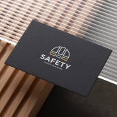
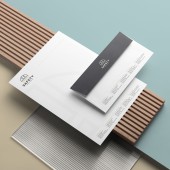
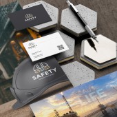
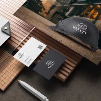
| DESIGN NAME: Safety Twenty Four Seven PRIMARY FUNCTION: Brand Identity INSPIRATION: I believe that the minimalism is the best approach to logo design. In designing the Safety 24-7 logo, I chose the helmet, which is a main tool in various types of dangerous work, and at the same time it is a familiar tool for most people. Logo colors indicate work environments that need safety, namely desert, sea and various industrial environments. UNIQUE PROPERTIES / PROJECT DESCRIPTION: A brand identity design for Safety 24/7, A multi-national company specialized in providing high-level courses and training in industrial safety for workers in the fields of petroleum, construction, and others. The minimalist logo design is inspired by the idea of the helmet, which is considered one of the most important tools in this field. The three visual identity colors are inspired by different workplace environments, such as seas, deserts and factories. OPERATION / FLOW / INTERACTION: - PROJECT DURATION AND LOCATION: The project started in January 2022 and finished in March 2022. FITS BEST INTO CATEGORY: Graphics, Illustration and Visual Communication Design |
PRODUCTION / REALIZATION TECHNOLOGY: - SPECIFICATIONS / TECHNICAL PROPERTIES: The whole design of the brand identity has been made using the color model CMYK, and the international print sizes. TAGS: Logo, Brand, Branding, Identity, Brand Identity, Logo Design, Creative, Visual Identity, Advertising, RESEARCH ABSTRACT: - CHALLENGE: The challenge was to come up with a new design that is innovative, minimal and at the same time close to the field of industrial safety, and that can attract attention and gain admiration. ADDED DATE: 2022-06-11 02:52:24 TEAM MEMBERS (1) : Tamer El-Menyawi IMAGE CREDITS: Tamer El-Menyawi, 2022. |
||||
| Visit the following page to learn more: https://www.behance.net/TamerMenyawi | |||||
| AWARD DETAILS | |
 |
Safety Twenty Four Seven Brand Identity by Tamer El-Menyawi is Winner in Graphics, Illustration and Visual Communication Design Category, 2022 - 2023.· Press Members: Login or Register to request an exclusive interview with Tamer El-Menyawi. · Click here to register inorder to view the profile and other works by Tamer El-Menyawi. |
| SOCIAL |
| + Add to Likes / Favorites | Send to My Email | Comment | Testimonials | View Press-Release | Press Kit | Translations |
| COMMENTS | ||||
|
||||


