DESIGN NAME:
Fuwa Fuwa
PRIMARY FUNCTION:
Dessert Cafe
INSPIRATION:
The goal is to introduce the cafe's warm and positive energy to an otherwise traditional plaza. It is neither a grab-and-go coffee place nor a sit-down restaurant. It exists in the intersection of the two, and cultivates the visual aesthetics of both; the vibrant brightness of the youth-led culture and the solid steadfast quality of a classic eatery. All the while infusing visual traits of Japanese design to reflect the Japanese style dessert that it serves.
UNIQUE PROPERTIES / PROJECT DESCRIPTION:
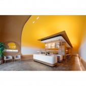
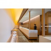
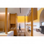
This modern café imbues the youthful energy of the desserts they serve, and the spirit of exploration and novelty found in the narrow walkways of old Kyoto streets. Seating is integrated on the side allowing for an unobstructed view and pathway down the length of the entire space, creating a unique focal point of depth, volume and curiosity.
OPERATION / FLOW / INTERACTION:
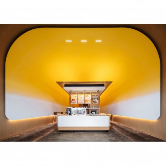
Visitors are greeted by the soft curve and bright yellow of the high canopy. It frames the modern temple like structure below. Light emanates from it, bringing light to all corners of the space. The sides are unobstructed yet what lies behind is hidden from view and remains to be explored. By entering the side valleys, two experiences become available; the hustle and bustle of pancake flipping and the cozy feeling of being tucked away from view.
PROJECT DURATION AND LOCATION:
Project start May 2020 and completed in November 2021. Located in Toronto, Canada.
FITS BEST INTO CATEGORY:
Interior Space and Exhibition Design
|
PRODUCTION / REALIZATION TECHNOLOGY:
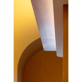
The placement of lighting and color were vital in achieving a warm ambience. Designer team worked closely with the lighting consultant to conclude a solution that can have even spread of lighting as it interacts with different material layers that softly lights up the café throughout, connecting adjacent areas.
SPECIFICATIONS / TECHNICAL PROPERTIES:
Project area of 167 square meters.
TAGS:
Studio Yimu, Interior Design, Commercial Design, Modern, Cafe Design, Dessert Cafe, Toronto, Canada
RESEARCH ABSTRACT:
The structure of the middle island references traditional temples found in Kyoto with its wooden posts, hanging menus, and visual proportions. The food prep counter is visible on the side and is reminiscent of watching food being prepared at street vendor stalls along a long stretch of road. Instead of covering the original flooring, the stripped back surface was kept, imperfections and all, to honor the imprint of time it reflects.
CHALLENGE:
The narrow and long space needed to fulfill three key needs: a space for delivery workers to wait, privacy for in-store customers where they can converse and dine undisturbed, and an accessible and highly visible front of house.
The pandemic has made take-out and delivery more prevalent and it became essential to consider the distribution of space in relation to the flow of traffic. How can the travel of customers be minimized? How can this narrow space host distinct zones for different customers in an organic and passive fashion?
The solution highlights the length of the space to create the effect of a warm Japanese alley street. Additionally, by placing the sales counter in the front of the curved element, it effectively becomes the entrance, creating two zones hidden from one another. It is highly visible and is the first point of contact for everyone. For those who choose to take-out, they stand "outside" of the portal. For those who dine in, they progress "inside".
ADDED DATE:
2022-05-26 22:14:28
TEAM MEMBERS (4) :
Creative Director: Ryan Chung, Designer: Long Wu, Designer: Chelsea Chen and Lighting Designer: Peter Ma
IMAGE CREDITS:
Image #1: Scott Norsworthy 2022
Image #2: Scott Norsworthy 2022
Image #3: Scott Norsworthy 2022
Image #4: Scott Norsworthy 2022
Image #5: Scott Norsworthy 2022
|


