DESIGN NAME:
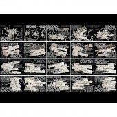
Second Hand Life
PRIMARY FUNCTION:
Poster
INSPIRATION:
I find that taking in a lot of fragmented information deprives us of a holistic, one-dimensional and one-pointed approach to information, and it is for this reason that people get one-sided, intensely personal and subjective information.
UNIQUE PROPERTIES / PROJECT DESCRIPTION:
The work Second Hand Life attempts to re-objectify language into visual graphics, in a programming structured Web language, presented graphically through binary as a container, and finally through a poster calling for more attention to this public social issue, which constitutes a greater danger than this, this fragmented reception of information deprives us of the information we get from the whole, one dimension, one perspective.
OPERATION / FLOW / INTERACTION:
The language of the poster and the design of the book are used to convey the message to the audience.
PROJECT DURATION AND LOCATION:
2022.5.23 in Hangzhou, China
FITS BEST INTO CATEGORY:
Graphics, Illustration and Visual Communication Design
|
PRODUCTION / REALIZATION TECHNOLOGY:
A series of posters and books designed to convey the theme of second-hand life
SPECIFICATIONS / TECHNICAL PROPERTIES:
A series of 20 A3-sized posters arranged for the main visual effect, book mounted and bound
TAGS:
Poster、Concept、Books
RESEARCH ABSTRACT:
Since the deepening of the age of short videos and information technology, more and more people have become concerned with the problem of information reception in the face of an endless torrent of information. This design work will use the language of poster design to express why people's ability to discriminate is diminished by information in today's social environment, and to explain how this subconscious lure of information reception has profound effects.
CHALLENGE:
Initially there was a lack of a font that would adequately convey the theme, so what font would represent the message and what font would tie the poster together and create a sense of interaction. After a lot of research, we found that binary was a good way to express the theme of the design. Firstly, the symbols '1' and '0' in binary are exactly the same as the symbols 'true' and 'false' in logical operations. The symbols "1" and "0" correspond to "true" and "false" in logical operations, which corresponds very well to the second-hand life of the discriminating acceptance of information and the ability to judge one's own thinking by its control.
ADDED DATE:
2022-05-23 06:39:41
TEAM MEMBERS (1) :
IMAGE CREDITS:
Yilin Wang, 2022.
|


