LPCP 5th Anniversary Newspaper Design by Yen Lin Shen |
Home > Winners > #141542 |
 |
|
||||
| DESIGN DETAILS | |||||
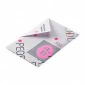
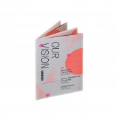
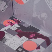
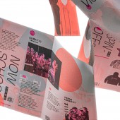
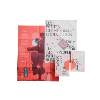
| DESIGN NAME: LPCP 5th Anniversary PRIMARY FUNCTION: Newspaper Design INSPIRATION: This newspaper is based on the designer's in-depth understanding of the dance group's history, spiritual concepts, activities, and past performances, to find symbols with different symbolic meanings, and hope that the audience can read this newspaper with enjoyable participation and can clearly understand knowing this contemporary dancing group more systematically. UNIQUE PROPERTIES / PROJECT DESCRIPTION: This newspaper design changed the way ordinary readers read. This newspaper consists of two posters folded in different ways and divided into at least six different visions through interactive folding and creative ingenuity. Newspapers will no longer be treated as one-off consumables while also adding value to those who want to collect them. At the same time, it also helps the dance group easier to remember and impress more audience. OPERATION / FLOW / INTERACTION: Envelope When the poster was folded into an envelope, I deliberately used a fluorescent pink sticker that was precisely the same size as the dots, which were hidden among numerous dots, on the poster to fit the envelope seal. The sticker's position would be different from person to person each time, but it can be integrated into the picture. This also expresses the feeling of "NOW" that LCPC wants to emphasize. The back of the outer poster In 2019, LPCP customized an international dance festival, "Battle Jam," for <Taiwan International Festival of Arts of National Theater Concert Hall>. As there is a rectangular plaid stage, the Designer used uneven square color blocks in the center of the back of the outer poster to simulate the same pattern. Then, I used it as background and placed a photo of a group of people who were in a dance competition. I also interspersed the title and subtitle on it. When the vision extends from the outer poster to the central square stage, the four corners of the paper are slightly erected along the folding line. It can vaguely see a group of people dancing around in various forms. That is to restore the original scene of "Monday School." The front of the Inside poster When the audience is unpacking this folded poster, regardless of whether they have an artistic background or not, through the creation of this newspaper, they can inspire their innate aesthetic and appreciate this artistic booklet. It is also a response to the concept of "Everyone can Dance" and "Boundless Creativity." On the inner front is a booklet that can be unfolded into a poster. The booklet records some important events of the dance troupe. In order to avoid standardization, It used thin slanted dots to make the image of the group dancers and placed them in every corner of the front of the poster. When reading the newspaper, the readers not only can understand the important events of LPCP but also find the figures of dancers on every page. Back of inner poster [Fighters] is LPCP'S current central performance. PROJECT DURATION AND LOCATION: The designer began to contact the dancing group at the end of 2020. Still, due to the COVID-19 epidemic, the production was suspended for a few months and finally published in August 2021 in Taiwan. FITS BEST INTO CATEGORY: Graphics, Illustration and Visual Communication Design |
PRODUCTION / REALIZATION TECHNOLOGY: In this work, dots of various sizes are used. However, when the density of the dots is high and the size is small, the cross pattern of the optical illusion of the grid will be generated, which will affect design quality and make it difficult to read. Therefore, the printing house suggested that a crystal dots method could be used instead. It can achieve the desired effect and increase the positive impact on the works. SPECIFICATIONS / TECHNICAL PROPERTIES: It shows different densities and presents light and dark levels through various degrees of thickness. This time the prints are made of ivory paper with a smooth feel. To add visual richness, the designer added two unique fluorescent colors in addition to four colors for printing to make the vision more saturated and colorful. Through the knife mold turn, the single poster becomes a booklet and a wrapped envelope, increasing interest in the newspaper structure. TAGS: A,Contemporary dance B,Public participation C,Taiwanese culture D,Boundless creativity, E. Newspaper introduction RESEARCH ABSTRACT: First of all, to wrap the two posters together in a particular way, a mathematician must consult to calculate the unique layout, knowing the size of the inner booklet. Countless tests were done with the help of the printing house. And trying different pleat methods achieve the effect of perfectly covering the two posters. The designer and the editor-in-chief have also discussed and preliminary understanding of the dancing group through several times online interviews. In addition, the designer also personally experienced the contemporary dance and was paired with members of the dancing group. Some oral interviews and learning more about the inspiration might be adopted. This is not an easy task because the concept of spirituality and contemporary dance are very abstract. Then, the designer took the fragmented inspiration fragments in his life, took notes with simple text descriptions on the mobile phone, and slowly pieced together the working prototype. On the other hand, because the designer initially wanted to present the work in Risograph printing, but due to the size limitation, He spent a lot of time researching how to simulate a similar effect with graphic design technology. CHALLENGE: The biggest challenge is organizing and summarizing a large amount of information, using only two posters to transform various visual effects while allowing the experiencer to participate in the art and understand the information. ADDED DATE: 2022-05-21 19:20:57 TEAM MEMBERS (1) : IMAGE CREDITS: Graphic Designer/Yen Lin Shen Chief Editor/ Yun Cheng Chen PATENTS/COPYRIGHTS: Published in August 2021 Copyright: Les Petites Choses Production |
||||
| Visit the following page to learn more: https://yenlinshen-design.com/newspaper- |
|||||
| AWARD DETAILS | |
 |
Lpcp 5th Anniversary Newspaper Design by Yen Lin Shen is Winner in Print and Published Media Design Category, 2022 - 2023.· Read the interview with designer Yen Lin Shen for design LPCP 5th Anniversary here.· Press Members: Login or Register to request an exclusive interview with Yen Lin Shen. · Click here to register inorder to view the profile and other works by Yen Lin Shen. |
| SOCIAL |
| + Add to Likes / Favorites | Send to My Email | Comment | Testimonials | View Press-Release | Press Kit | Translations |
Did you like Yen Lin Shen's Print Design?
You will most likely enjoy other award winning print design as well.
Click here to view more Award Winning Print Design.


