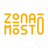
Zona Mosto Brand Identity by Emanuele Grittini |
Home > Winners > #141391 |
 |
|
||||
| DESIGN DETAILS | |||||
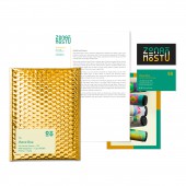
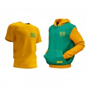
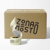
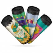
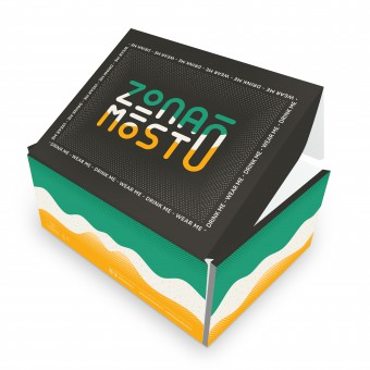
| DESIGN NAME: Zona Mosto PRIMARY FUNCTION: Brand Identity INSPIRATION: The entire Zona Mosto project takes inspiration from a mixture of graphic and illustrative styles, to make the product unique and distinguishable. The illustrations, all of a surreal subject, have various themes that are related to the namming of the type of beer. But all draw their style from the logo and the strong and lively colors of the brand. UNIQUE PROPERTIES / PROJECT DESCRIPTION: The design of the Zona Mosto brand is made unique by several factors. The first of all is the custom font. In fact, even having looked for a font suitable for the purpose, none existed with the required characteristics. This led to a complete design from scratch of the typography that makes up the logo. Another important unique and distinctive element are the corporate colors, orange derives from the amber shade of two of the beers that Zona Mosto produces, the cream, instead of the color of the beer foam and the green of the freshly picked hops. These 3 colors fully represent the concept of beer at the palette level, helping the brand to be even more communicative. The last factor that makes the brand unique is its ability to be minimal but very strong, the audience sample analyzed recognized the brand among many even after several days and in the midst of other brands. OPERATION / FLOW / INTERACTION: Being a brand identity of a company that produces beer, the main purpose of interaction is to create appeal and lead the consumer to buy the brand's product. Making sure that the beer connoisseur recognizes himself in it and wants to buy and try the product. PROJECT DURATION AND LOCATION: The project started in August 2021 in Milan and is still underway with the creation of new labels. FITS BEST INTO CATEGORY: Graphics, Illustration and Visual Communication Design |
PRODUCTION / REALIZATION TECHNOLOGY: The creation of the brand was achieved in several steps, the first by hand, using pencils and sheets to create the drafts of the typography. Secondly, Adobe Illustrator was used to create the vector logotype. The next step was to create all the various corporate materials with Adobe Indesign and Adobe Illustrator. All on the mac os platform. SPECIFICATIONS / TECHNICAL PROPERTIES: - TAGS: Zona Mosto, Beer Can, can labels, Branding, Brand identity, beer brand, corporate identity, beer branding, beer,, RESEARCH ABSTRACT: To create the Zona Mosto brand various competitors in the sector were analyzed, identifying the best microbreweries that had the following characteristics: high quality of the beer produced, wide diffusion of the brand, attention to design and to current trends. As a result, three microbreweries were chosen and analyzed to understand their strengths and weaknesses. The winning characteristics have been derived from them, such as: originality, non-conformism, extreme attention to product quality, the construction of a strong and well-defined brand. The next step of the analysis compared the target of Zona Mosto with the characteristics required to make the product salable and appealing to buyers, finding a good alignment between the wishes of the various buyer personas and the brand's proposal. Having understood the fundamental characteristics and values of the brand through analysis, we moved on to the construction of a visual identity system that complied with these results by creating specific stylistic moodboards proposed to a sample of users loyal to the buyer personas created to obtain feedback. on which communication was the best and most efficient. As a result we received unanimous feedback on certain choices which then led to the use of a certain style for the brand. The result was great, consumers enjoyed the Zona Mosto brand very much. CHALLENGE: As the brand was just born, there was no historical background. The values, the mission and the target were created from scratch. On the part of the customer, however, there was a precise idea of what the reference target was, which was then confirmed by the analyzes carried out, this allowed to create a strong brand with solid foundations with a well-defined audience and an independent soul. We also tried not to imitate the big brands that produce beer, both in style and in the entire design. Going to give an exclusive "flavor" to each material produced, from the logo to the site to the labels. Finally, the biggest challenge of the project was to create a unique style and trait, which the consumer could only associate with the Zona Mosto brand. This is due to the large amount of microbreweries existing in the Italian market and their continuous transformation. For example, many of the brands existing today, which are competitors of Zona Mosto, use a different illustrative style each time on each can label, creating recognition problems and confusing the buyer many times. I am happy to say Zona Mosto is unmistakable, thanks also to tests made during the sale in some beershops in the Milan area, where buyers went "without fail". ADDED DATE: 2022-05-13 13:58:30 TEAM MEMBERS (1) : IMAGE CREDITS: Emanuele Grittini, 2022. PATENTS/COPYRIGHTS: Copyright Zona Mosto All Right Reserved. |
||||
| Visit the following page to learn more: https://zonamosto.it/ | |||||
| AWARD DETAILS | |
 |
Zona Mosto Brand Identity by Emanuele Grittini is Winner in Graphics, Illustration and Visual Communication Design Category, 2022 - 2023.· Press Members: Login or Register to request an exclusive interview with Emanuele Grittini. · Click here to register inorder to view the profile and other works by Emanuele Grittini. |
| SOCIAL |
| + Add to Likes / Favorites | Send to My Email | Comment | Testimonials | View Press-Release | Press Kit |

