Biblioteche di Roma Rebranding by Ragu Communication |
Home > Winners > #140666 |
 |
|
||||
| DESIGN DETAILS | |||||
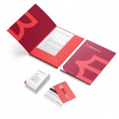
| DESIGN NAME: Biblioteche di Roma PRIMARY FUNCTION: Rebranding INSPIRATION: In this new identity we find the book, already familiar from the historic logo - represented by the illustration of a closed book resting on its side - but with an important change: it is an open book, a powerful symbol of accessibility, because it is open and accessible to the entire Biblioteche network UNIQUE PROPERTIES / PROJECT DESCRIPTION: To convey the idea of an agile structure such as Istituzione Sistema Biblioteche di Roma (Rome’s public libraries), which on its 25th anniversary needed to reflect its essence with greater force, we created a new identity to express innovation and accessibility. The identity of Biblioteche, in all its applications, is linked to the presence of the institutional brand Roma Culture of the Department for Cultural Growth of the Municipality of Rome which is a stakeholder in Biblioteche system. OPERATION / FLOW / INTERACTION: With the creation of a new identity with a more accessible, modern and inclusive design, a brand such as that of the public libraries of Rome has maximum impact, proving to be a powerful tool for the recognisability of the image of this service organised in a widespread network of branches throughout the Municipality of Rome. Users can therefore easily associate the visual identity with the service provided, recognise it and use it as a result. PROJECT DURATION AND LOCATION: The project began in Rome in January 2021 and was delivered to the client in April 2021 FITS BEST INTO CATEGORY: Graphics, Illustration and Visual Communication Design |
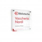
PRODUCTION / REALIZATION TECHNOLOGY: The idea was to reproduce the symbol of an open book that could be read at the same time as the first letter of the brand. A clean, essential graphic sign, perfect for dialogue with local but also international institutions. SPECIFICATIONS / TECHNICAL PROPERTIES: The coordinated image was applied to all physical and digital touchpoints of the Biblioteche di Roma system: -Stationery system -Digital touchpoints -Adv -OOH -Signage TAGS: ragu communication, brand identity, rebranding, institutional communication, concept, graphic, logo, corporate identity, brandbook, anniversary campaign RESEARCH ABSTRACT: - CHALLENGE: On reaching the milestone of its twenty-fifth anniversary, the Istituzione Sistema Biblioteche di Roma, felt the need to reflect its contemporary and accessible essence more effectively. A challenge of innovation and simplification accepted by Ragù Communication. The Rome-based studio has in fact conceived and designed a new brand identity with the power to fully convey the idea of an agile and modern institutional structure. ADDED DATE: 2022-04-01 09:47:56 TEAM MEMBERS (7) : Creative Head: Martina Venettoni, Creative director & Art: Stefano Coccia, Head of Copy: Sara Dal Zotto, Senior art director: Alessandro Marchese Ragona, Senior art director: Andrea Venanzi, General manager: Giovanna Montani and Account supervisor: Cinzia Cecconi IMAGE CREDITS: Ragu Communication PATENTS/COPYRIGHTS: Istituzione Sistema Biblioteche Centri Culturali of the Municipality of Rome |
||||
| Visit the following page to learn more: https://ragucommunication.com | |||||
| AWARD DETAILS | |
 |
Biblioteche Di Roma Rebranding by Ragu Communication is Winner in Graphics, Illustration and Visual Communication Design Category, 2021 - 2022.· Press Members: Login or Register to request an exclusive interview with Ragu Communication. · Click here to register inorder to view the profile and other works by Ragu Communication. |
| SOCIAL |
| + Add to Likes / Favorites | Send to My Email | Comment | Testimonials | View Press-Release | Press Kit |


