ITmaestro Website by Alice Kalnitska |
Home > Winners > #140570 |
 |
|
||||
| DESIGN DETAILS | |||||
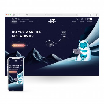
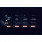
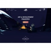
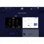
| DESIGN NAME: ITmaestro PRIMARY FUNCTION: Website INSPIRATION: You doesn't like Bigfoot? You didn't see Bigfoot! New Year holidays, snow, sledding and of course forest animals, especially Bigfoot, who is the main character of this idea. On the site design you will find 55+ of individually drawn illustrations, humor and interesting animations. Enjoy watching! UNIQUE PROPERTIES / PROJECT DESCRIPTION: ITmaestro is one of the leading design agency. The main direction is design for websites and applications. They managed to work with popular brands and are actively developing. This is the 3rd redesign of the site, which was very liked by both clients and blog subscribers. OPERATION / FLOW / INTERACTION: The main direction of the site is ordering design for websites and mobile applications. Users can select the service they are interested in the navigation menu, view the portfolio, clients, read about the company. Depending on the user device, the way of navigating the site changes. Top navigation on PC version. And a hamburger menu on mobile devices. Also, users can select the language, turn the sound on or off. As a result, customers can contact the specified contact details or fill out and submit a contact form. PROJECT DURATION AND LOCATION: The last redesign started in February 2019 in Kharkiv, Ukraine. Published on the web in January 2020. Update December 2021 - until now. |
PRODUCTION / REALIZATION TECHNOLOGY: Illustrations: Adobe Illustrator; UX/UI design: Miro & Adobe Xd; Image retouching: Adobe Photoshop; Development: HTML, CSS, JavaScript, PHP, SQL. SPECIFICATIONS / TECHNICAL PROPERTIES: The website is designed to be fully responsive: 4k resolution, laptops, smartphones, tablets and other devices. Available in the latest versions of Chrome, Firefox, Safari, iOS and Android. TAGS: UX, UI, Website, Web design, Interface, Responsive, ITmaestro design, Alice K RESEARCH ABSTRACT: 1. Before moving on to visual interface design, UX/UI designer Alice K conducted research on the target audience.. A separate group of new users who are interested in web and mobile design services, and a briefing was also held for past clients, who had already order design. An analysis of competitors' websites and applications was carried out in order to prioritize the future structure and functionality: what is needed and not needed for users. Alice K briefed over 80,000 of their subscribers in social networks on the subject of ideas for a new site, the best of which were designed. 2. After that, a sitemap, wireframe and prototype of project were designed; 3. Alice K and ITmaestro team moved on to visual design, illustrations, development and animations; 4. The site has been tested for usability on different types of users (and on different devices), as a result of which errors were found and eliminated (in order of priority) that made it difficult for users to achieve the goal. 5. Since the ITmaestro website is constantly evolving, usability tests, system load, site loading speed, support for all popular devices and other important tests and studies are regularly conducted. CHALLENGE: We created the studio website for about a year, perfecting everything to the last pixel. And constantly update it based on user experience and customer reviews. ADDED DATE: 2022-03-30 23:02:57 TEAM MEMBERS (2) : Artist & Designer: Alice K and Developer: Oleg K IMAGE CREDITS: Alice K, 2022 |
||||
| Visit the following page to learn more: https://it-maestro.com/en/ | |||||
| AWARD DETAILS | |
 |
Itmaestro Website by Alice Kalnitska is Winner in Website and Web Design Category, 2021 - 2022.· Press Members: Login or Register to request an exclusive interview with Alice Kalnitska. · Click here to register inorder to view the profile and other works by Alice Kalnitska. |
| SOCIAL |
| + Add to Likes / Favorites | Send to My Email | Comment | Testimonials | View Press-Release | Press Kit | Translations |


