DESIGN NAME:
Kosmoid
PRIMARY FUNCTION:
Brand Identity
INSPIRATION:
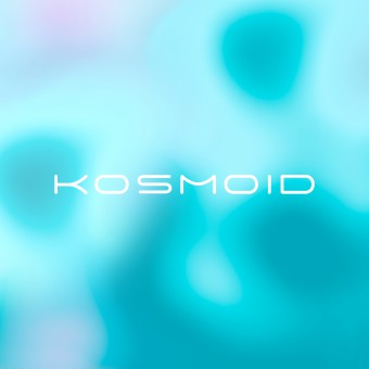
The whole visual language was inspired by Enceladus, the sixth-largest moon of Saturn which has an unusual and breathtaking scenery. It is covered mostly by ice and has an extremely reflective surface (reflects 90% of Sun`s light). This makes it and out of this world place, perfect to match a highly technological brand with a futuristic hint.
UNIQUE PROPERTIES / PROJECT DESCRIPTION:
Kosmoid is a RegTech company that unites human capital, legal expertise, technology and automation to address, process and comply with anti-money laundering requirements.
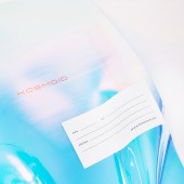
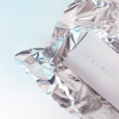
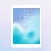
To communicate the brand`s innovative spirit and complete range of services we combined strong minimalism with pure white and topped this with liquid metal, holographic and reflective materials. Highly minimalistic look with lots of white and reflective surfaces inspiring a sense of pureness, absolute precision and uncompromised quality.
OPERATION / FLOW / INTERACTION:
The extreme purity of plain extra white combined with minimalistic typography inspires a feeling of flawless and efficient company and all reflective holographic materials add up to the image of a technologically proficient company with innovative spirit.
PROJECT DURATION AND LOCATION:
The process of developing this identity took around 5 months.
FITS BEST INTO CATEGORY:
Graphics, Illustration and Visual Communication Design
|
PRODUCTION / REALIZATION TECHNOLOGY:
A brand identity created with the use of fluid and sinuous shapes, reflective materials, liquid metal and holographic foil. The foil reflects all colors, thus representing the whole range of services provided.
SPECIFICATIONS / TECHNICAL PROPERTIES:
We developed their logo, brand style with special attention to the brand imagery, for which we created a series of 3D models which were later on animated and covered with reflective materials.
TAGS:
branding, brandidentity, visualcommunication, graphicdesign, cosmos, technology, startup, communication
RESEARCH ABSTRACT:
The main research performed was in terms of materials and innovative print techniques and technologies as it is pouring liquid metal and covering it with holographic foil.
CHALLENGE:
The biggest challenge was to communicate the dynamic range of services and technologically advanced spirit for a company that needs to have a trustable and serious brand language.
ADDED DATE:
2022-03-30 20:00:07
TEAM MEMBERS (1) :
Creative Director - Yana Okoliyska
IMAGE CREDITS:
SQUARED, 2021.
|

