Petchoy Branding Branding by M — N Associates |
Home > |
 |
|
||||
| DESIGN DETAILS | |||||
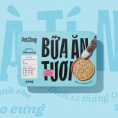
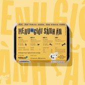
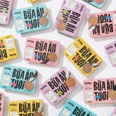
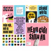
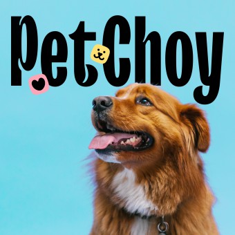
| DESIGN NAME: Petchoy Branding PRIMARY FUNCTION: Branding INSPIRATION: PetChoy provides delicious meal plans for cats and dogs in Saigon, Vietnam. Founders think pets should be served as their owners. PetChoy aims to educate and empower the pet-loving community with an accurate and comprehensive understanding of pets' nutrition and health. UNIQUE PROPERTIES / PROJECT DESCRIPTION: The new logo is a purely typographic design from TT Trailers with characteristic inktraps inspired by happy wagging tails. Combined with pet's choice and pet's joy, we want to visualize the happy choice of a pet when knowing they're getting PetChoy for mealtime. To define the cat and dog product line, we designed cat and dog characters minimally and brought them subtly into letter A's negative space. OPERATION / FLOW / INTERACTION: The original brief was a rework task on the logo and surface design of current packaging to extend for more future product lines and the client doesn't know their target customer or certain visual direction for next. There's a serious issue with branded visual display on wholesaler's shelves due to the current packaging. Thinking pets should have cool and triggering packaging design with bold branding, we turn the project into a completely new branding system with a tactical strategy to target GenZ and urbanists through the high-end serving restaurant concept for pets. PROJECT DURATION AND LOCATION: 5 months and launched in June 2021, Ho Chi Minh City, Vietnam FITS BEST INTO CATEGORY: Graphics, Illustration and Visual Communication Design |
PRODUCTION / REALIZATION TECHNOLOGY: The cover label was offset printed with laminated covering for cold storage conditions. The box and lid were sourced from a Vietnam manufacturer with high quality for food storage and microwave capability. SPECIFICATIONS / TECHNICAL PROPERTIES: A flat wrapper width 180mm x length 126mm x height 44mm TAGS: petchoy, pet food, pet, food, packaging, branding, paws, cute, typography, vietnamese RESEARCH ABSTRACT: In contrast with the usual market standard, we took the packaging to a typographic-based layout that the word means Fresh Meal becomes the main element, giving a strong message to define the product and distinguish PetChoy on shelves from others that use pet images. The paw and the dog or cat icon will describe what the product is for, complementing with restaurant ticket gives full information about the meal. CHALLENGE: Taking PetChoy from a blank generic brand, TT Trailers was chosen by its great fitted personality, through inktrap, funky narrow shape design. Working closely with TypeType, we developed TT Trailers Petchoy with happy tail-and-ear-inspire ADDED DATE: 2022-03-30 05:50:30 TEAM MEMBERS (9) : Design firm: M — N Associates, Executive Creative Director: Duy — N, Creative Director: Anh Nguyễn, Content Director: Quân Nguyễn, Social Art Director: Anh Phạm, Designer: Quân Nguyễn, Web Designer: Anh Nguyễn, Producer Manager: Quân Nguyễn and Project Manager: M — Lan IMAGE CREDITS: Photography Wing Chan (Lifestyle / Food / Portfolio) Digital Retoucher An Nguyễn PATENTS/COPYRIGHTS: © M — N Associates 2021, Vietnam |
||||
| Visit the following page to learn more: http://tinyurl.com/petchoycase | |||||
| AWARD DETAILS | |
 |
Petchoy Branding Branding by M — N Associates is Runner-up for A' Design Award in Graphics, Illustration and Visual Communication Design Category, 2021 - 2022.· Press Members: Login or Register to request an exclusive interview with M — N Associates. · Click here to register inorder to view the profile and other works by M — N Associates. |
| SOCIAL |
| + Add to Likes / Favorites | Send to My Email | Comment | Testimonials |

