Zona Mosto Labels for Beer Cans by Emanuele Grittini |
Home > Winners > #139819 |
 |
|
||||
| DESIGN DETAILS | |||||
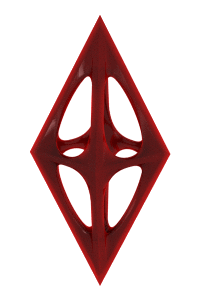
| DESIGN NAME: Zona Mosto PRIMARY FUNCTION: Labels for Beer Cans INSPIRATION: The entire Zona Mosto project takes inspiration from a mixture of graphic and illustrative styles, to make the product unique and distinguishable. The illustrations, all of a surreal subject, have various themes that are related to the namming of the type of beer. But all draw their style from the logo and the strong and lively colors of the brand. UNIQUE PROPERTIES / PROJECT DESCRIPTION: The design of the Zona Mosto labels is made unique by several factors. The first of all is the die-cutting of the same. It is the first Italian artisan microbrewery that has dared on this front. Bringing a novelty immediately imitated by competitors for its originality and freshness. Then we have the illustrations, which all have the same recognizable stylistic trait and an always surreal subject, which links the beer product to the mood in which it should be enjoyed. The brand's payoff exactly reflects its product: "Crafting beers for modern drinkers". OPERATION / FLOW / INTERACTION: The use of the can instead of the classic bottle has been designed to better maintain the properties of the beer it contains, so as to shield from light and possible air infiltrations, keeping the product as if it had just been fed. The UV coating on the label, in addition to making the design more elegant and modern, helps to create grip on the palm of the hand and fingers, preventing the fresh can from the fridge from being slippery. PROJECT DURATION AND LOCATION: The project started in August 2021 in Milan and is still underway with the creation of new labels. FITS BEST INTO CATEGORY: Packaging Design |
PRODUCTION / REALIZATION TECHNOLOGY: To correctly process the die-cut labels to be placed on the can, we started with the creation of a template based on the measures of the can itself, in particular, circumference, height of the central part without flaring and a calculation of the margins to be applied for correct application . The illustrations are first created by hand, on a sheet bearing the label die, to then be redrawn using adobe illustrator. For each of them a specific palette was chosen that had the same characteristics of the colors of the brand while the stroke is typical of the illustrative style formulated for the project. The labels were printed on adhesive paper for food labels, then painted with a matte varnish to obtain a microsatin effect to reduce too sharp reflections. Finally, they were die-cut, each with its own made-to-measure die, and applied to the beer can by means of a semi-automatic machine. The latter is black to allow the colors of the label to be even more visible and more attractive to the consumer. SPECIFICATIONS / TECHNICAL PROPERTIES: Label spread: 180mm base x 126mm height. 330ml can size: 58mm diameter x 145.5mm height. Paper: 133 µ Ipanema Embossed White - White color. Print: CMYK - no special colors. Finish: matte UV varnish. TAGS: Zona Mosto, Beer Can, can labels, beer can labels, die-cut can labels, beer die-cut can labels, illustrations, vector illustrations, branding, RESEARCH ABSTRACT: To create the Zona Mosto brand and, consequently, the product labels, various competitors in the sector were analyzed, identifying the best microbreweries that had the following characteristics: high quality of the beer produced, wide diffusion of the brand, attention to design and to current trends. As a result, three microbreweries were chosen and analyzed to understand their strengths and weaknesses. The winning characteristics have been derived from them, such as: originality, non-conformism, extreme attention to product quality, the construction of a strong and well-defined brand. The next step of the analysis compared the target of Zona Mosto with the characteristics required to make the product salable and appealing to buyers, finding a good alignment between the wishes of the various buyer personas and the brand's proposal. Having understood the fundamental characteristics and values of the brand through analysis, we moved on to the construction of a visual identity system that complied with these results by creating specific stylistic moodboards proposed to a sample of users loyal to the buyer personas created to obtain feedback. on which communication was the best and most efficient. As a result we received unanimous feedback on certain choices which then led to the use of a certain style for the brand which was then declined on the illustrations, also going here to do a research aimed at the target audience to make the labels really interesting. In this phase it was discovered that in the samples analyzed, no one had ever used die-cutting to enrich the creative context of the visual, therefore - given the technical possibilities to do so - this element was included in the test phase to understand the public response. The result was great, a true innovation that has led some of the most famous Italian microbreweries to create die-cut labels, taking inspiration from those created for the Zona Mosto brand. CHALLENGE: As the brand was just born, there was no historical background. The values, the mission and the target were created from scratch. On the part of the customer, however, there was a precise idea of what the reference target was, which was then confirmed by the analyzes carried out, this allowed to create a strong brand with solid foundations with a well-defined audience and an independent soul. We also tried not to imitate the big brands that produce beer, both in style and in the entire design. Going to give an exclusive "flavor" to each material produced, from the logo to the site to the labels. Great attention was paid to the creation of a label that respected all relevant laws, both at the Italian and European level, also identifying the new legislature that gave new regulations on how and what to affix in the case of recyclable materials, thus having to design the label of the can so that all the information had the right hierarchy and were identifiable. Finally, the biggest challenge of the project was to create a unique style and trait, which the consumer could only associate with the Zona Mosto brand. This is due to the large amount of microbreweries existing in the Italian market and their continuous transformation. For example, many of the brands existing today, which are competitors of Zona Mosto, use a different illustrative style each time on each can label, creating recognition problems and confusing the buyer many times. I am happy to say that the must area cans are unmistakable, thanks also to tests made during the sale in some beershops in the Milan area, where buyers went "without fail". ADDED DATE: 2022-03-24 10:35:15 TEAM MEMBERS (1) : IMAGE CREDITS: Emanuele Grittini, 2022. PATENTS/COPYRIGHTS: Copyright Zona Mosto All Right Reserved. |
||||
| Visit the following page to learn more: https://zonamosto.it/beer-shop | |||||


| CLIENT/STUDIO/BRAND DETAILS | |
 |
NAME: Zona Mosto PROFILE: Zona Mosto was born in 2021, in Milan, after several video calls on the Milan / London axis, during the pandemic period, when the two founders Aris and Erides became aware of wanting to found an artisan microbrewery. We believe that beer is a powerful social aggregator, a product that in its simplicity manages to unite people, breaking down any type of barrier. For this reason we have chosen a name that recalled a place of sharing (Zona) and that could convey our passion for beer (Mosto). The intent is to bring to our drinkers the best realization of the concept of beer, it is no coincidence that our motto is "Crafting beers for modern drinkers". |

| AWARD DETAILS | |
 |
Zona Mosto Labels For Beer Cans by Emanuele Grittini is Winner in Packaging Design Category, 2022 - 2023.· Press Members: Login or Register to request an exclusive interview with Emanuele Grittini. · Click here to register inorder to view the profile and other works by Emanuele Grittini. |
| SOCIAL |
| + Add to Likes / Favorites | Send to My Email | Comment | Testimonials | View Press-Release | Press Kit |