DESIGN NAME:
Career Science
PRIMARY FUNCTION:
Learning Application
INSPIRATION:
For a learning platform that simplifies life’s toughest decisions, the journey of life formed the inspiration. From social conversations, gaming, shopping to dating, movies and music, the platform was designed keeping the audience interests at the core while celebrating their uniqueness to create an experience that reflects the world we live in. When they log on, the newness coupled with a sense of familiarity, makes them feel like the platform was designed specially to make them succeed.
UNIQUE PROPERTIES / PROJECT DESCRIPTION:
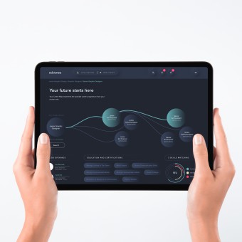
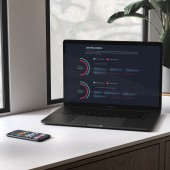
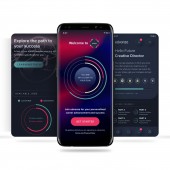
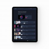
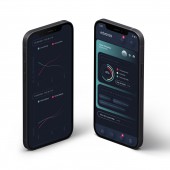
The journey of life is a composition of unique things. Hence, each section on the platform, inspired by life, was created to be unique. The course menu was designed like a music playlist. Complex analyses were simplified with graphics inspired by sci-fi movies. Career progress emulated growth in the natural order of life. Leaderboards were inspired by video games. Opportunities were showcased like collectible trading cards. The platform was simplified to make learning intuitive yet playful.
OPERATION / FLOW / INTERACTION:
When done right, platforms designed with a human-centred approach, look simple. Because at the core, they connect with people. Edvanza was therefore built to make learning look and feel like a lot of fun. The gap analysis, that solves for perceived gaps, was designed inspired by shopping apps, subliminally urging the user to act and do more. The course menu was designed to be as playful as a music playlist. The career map imitates growth in nature, branching into opportunities as the user grows.
PROJECT DURATION AND LOCATION:
May 2021 to August 2021, Mumbai, India
|
PRODUCTION / REALIZATION TECHNOLOGY:
Using design thinking methodologies, we designed this learning platform by first talking to people. The research was conducted remotely, spanning occupations and geography. Customised software was then used to analyse and match user patterns to predict social behaviour. Heat map screen testing was applied to identify and solve for blockages and drop outs across the user journey. Low fidelity wireframes were created and tested before designing and prototyping the platform on Figma.
SPECIFICATIONS / TECHNICAL PROPERTIES:
Learning platforms are used predominantly by students and entry level professionals, especially on the go. Hence we designed it mobile first. With design responsive fundamentals at the crux of this intuitive interface, we bootstrapped the platform to facilitate a user experience that seamlessly translates across devices. The platform screens were created in the 16x9 aspect ratio, rendering horizontally and vertically without compromising on the experience.
TAGS:
User interface, interactive interface, learning platform, learning application, UI, UX, human centred design, design thinking
RESEARCH ABSTRACT:
When designing the platform, we integrated the fundamentals of design thinking into the process. We talked to over a 1000 people to understand what makes them tick and factored in their current interests to design an involved user interface, adding a human touch to AI learning. We structured the navigation based on the apps they love, covet and most frequently use. The visitors would then need to rely on muscle memory to explore the platform while their minds remained focused on their goals.
CHALLENGE:
To create a platform like no other, social media behaviour, professional networking, learning and career guidance, all had to be integrated into one seamless platform. As every individual’s career path is as unique as the person himself, it was imperative to encapsulate the individual journey. This required talking to over 1000 people from different walks of life, backgrounds, each with unique aspirations and analyse their behaviour to simply take the rocket science out of career growth.
ADDED DATE:
2022-03-19 16:14:10
TEAM MEMBERS (7) :
Roy Menezes, Yash Chauhan, Ranjeet Bubber, Zara Daruwalla, Saurabh Choudhary, Malavika Shah and Anamta Shaikh
IMAGE CREDITS:
Centrick, 2021.
|
