House of Solace Studio Apartment by Anushka Contractor |
Home > Winners > #139458 |
 |
|
||||
| DESIGN DETAILS | |||||
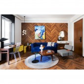
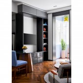
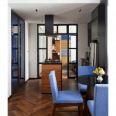
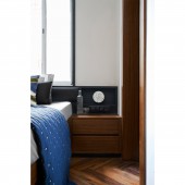
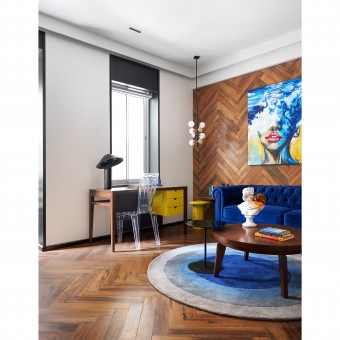
| DESIGN NAME: House of Solace PRIMARY FUNCTION: Studio Apartment INSPIRATION: The designer decided to go for a timeless French aesthetic infused with modern sensibilities. The client's brief was simple to Spruce it up in the Sanctioned Budget. And gave the designer the freedom to do so. The knowledge that this is a singleton’s home at that set the tone for the design approach. A color palette of white, black, greys with a smattering of electric blue and pop yellow was zeroed down to bring in the urbane. Each furniture element was customized and meticulously detailed. UNIQUE PROPERTIES / PROJECT DESCRIPTION: A compact studio apartment in one of the Art Deco buildings which was built during the British Rule in India. The apartment afforded luxuries and the symmetry of an over-10ft height ceiling. The designer converted a one bedroom space into a large studio apartment for a singleton and decided to go for a timeless French aesthetic infused with modern sensibilities - low maintenance & high functionality. OPERATION / FLOW / INTERACTION: An eight feet tall teak wood finish main door opens to a cosy living room that is filled with natural light courtesy a large window and a tiny balconette. The wall between this room and the kitchen has been demolished and the open kitchen now effectively makes this living space appear larger. Wooden look tiles were laid on the floor which not only it spreads across the studio but also seeps up the living room main wall. Upon this wall, hangs an artwork commissioned to a young artist to be evocative yet flaunt the yellow and blue that ties the otherwise sombre colors together. A black skirting flows throughout the walls with a wood detailing as an added design detail. As the client largely works from home, there was a request for a large desk. The window, was given a black detail to give the illusion of height, capitalizing on the natural light. Across this set up is a TV wall unit with storage and shelves to display curios. The small balcony was enclosed, creating a serene spot for the client. An art deco chair, a side table, some indoor green and a ceiling light for when the sun fades. Flowing out of the living area the kitchen is compact and fuss free and has an island with a cooking console, an overhead chimney and storage drawers beneath. This is flanked by a work top and appliances at one end and a built-in glass cabinet at the other. Black finish door frame and blue paneled shelves inside doubles up as a bar. The bedroom has a large black framed glass double door at the entrance, a wardrobe on the left and a slender panel on one side for shelving. Adjacent to this is a mirror feature we designed for this home. A queen-sized bed takes up the rest of the tight room and its headboard is matte black and upholstered for extra comfort. In the bathroom, the fittings are black, walls are powder blue, cabinets are a mellow shade of lemon and tiles which are a play of our monochromatic colors. PROJECT DURATION AND LOCATION: The project started in November 2020 and finished in March 2021 in Colaba, Mumbai, India. FITS BEST INTO CATEGORY: Interior Space and Exhibition Design |
PRODUCTION / REALIZATION TECHNOLOGY: A combination of Teak wood and Polyurethane paint finish was used for furniture. Concrete, Terrazzo and Metal was used for all decorative lights. Wooden look tiles were laid on the floor, pre-cut into four pieces and organized in the herringbone pattern. This is not only spread across the studio but also seeps up the living room main wall. The island of the kitchenette is cladded with cut sections of plywood which is finished in matt polish to enhance its layers. SPECIFICATIONS / TECHNICAL PROPERTIES: The project covers a total of 490 sq.ft area. TAGS: Bachelor pad, Studio apartment, One bedroom apartment, Art deco, Parisian design, Wood, Colors, Colaba, South Mumbai, India RESEARCH ABSTRACT: The wall between the living room and the kitchen had been demolished and the open kitchen was effectively making this living space appear larger. Since this building was built during the British rule, breaking the existing 40mm thick old terrazzo floor seemed risky. Therefore, wooden look tiles were laid on the floor, pre-cut into four pieces and organized in the herringbone pattern. This is not only spread across the studio but also seeps up the living room main wall. Each space has an interesting feature: The Living room - A TV wall unit with storage for gadgets and shelves to display curios picked up across travels, is connected to the kitchenette making it a one large unit but still maintaining its independent roles. The Kitchenette - An island houses the cooking console with an overhead chimney and storage drawers beneath. The unit is designed using raw cut plywood edge pieces running throughout the exterior and is given a matt varnish to enhance its raw rustic sharp texture. The Bedroom - A large black framed glass double door partition instead of a single solid door lead the way to the client’s bedroom. A tall mirror on the wall along which is a custom designed rug in our chosen colors flows into a two toned circular rug on the floor. Quite a feature on a wall background. CHALLENGE: The Bedroom - An innovative mirror feature we designed for this home. A tall mirror along which is a runner in our chosen colours. In jest, we call these our House colours akin to a royal lineage. This runner flows into a circular rug on the floor, lending warmth to the wood tiled floor. The challenge was to give ample height and storage to this compact home even though it was for a singleton. We had to make this space appear way larger than it looked to get in as much natural light and create a uniform warmth to this space. ADDED DATE: 2022-03-19 14:56:46 TEAM MEMBERS (1) : IMAGE CREDITS: Image #1 : Photographer Zhen Wei Studios-Yadnyesh Joshi Image #2 : Photographer Zhen Wei Studios-Yadnyesh Joshi Image #3 : Photographer Zhen Wei Studios-Yadnyesh Joshi Image #4 : Photographer Zhen Wei Studios-Yadnyesh Joshi Image #5 : Photographer Zhen Wei Studios-Yadnyesh Joshi |
||||
| Visit the following page to learn more: https://www.as-colab.com/ | |||||
| AWARD DETAILS | |
 |
House of Solace Studio Apartment by Anushka Contractor is Winner in Interior Space and Exhibition Design Category, 2021 - 2022.· Read the interview with designer Anushka Contractor for design House of Solace here.· Press Members: Login or Register to request an exclusive interview with Anushka Contractor. · Click here to register inorder to view the profile and other works by Anushka Contractor. |
| SOCIAL |
| + Add to Likes / Favorites | Send to My Email | Comment | Testimonials | View Press-Release | Press Kit |
| COMMENTS | ||||||||||||
|
||||||||||||
Did you like Anushka Contractor's Interior Design?
You will most likely enjoy other award winning interior design as well.
Click here to view more Award Winning Interior Design.


