Siela Cosmetic Packaging by Olga Takhtarova |
Home > Winners > #139422 |
 |
|
||||
| DESIGN DETAILS | |||||
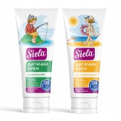
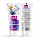
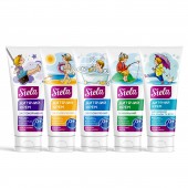
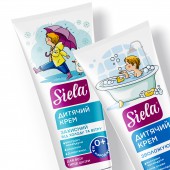
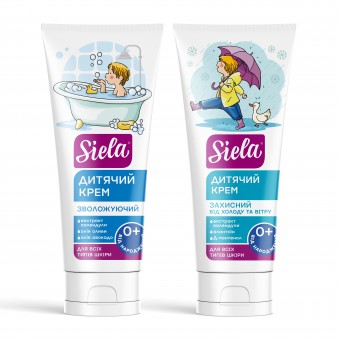
| DESIGN NAME: Siela PRIMARY FUNCTION: Cosmetic Packaging INSPIRATION: Ukrainian brand Siela Cosmetic has a proven reputation as a manufacturer of natural and effective products. The company's developments consist of natural first-rate raw materials. Therefore, they do not cause allergic reactions, guarantee users proper care, and, in addition, meet high European standards. At the beginning of 2021, they were going to expand the line of children's cosmetics for the youngest and saw an opportunity to improve the effectiveness of the packaging. UNIQUE PROPERTIES / PROJECT DESCRIPTION: The solution was to develop illustrations, which are now central to the design. The designer created a story for the product, placing the character at the center of the brand identity and making it an essential element of brand communication. The story is translated through the packaging design. The character of the created stories gets into different places and situations. Color coding was also added to help distinguish the products in the line. OPERATION / FLOW / INTERACTION: The designer wanted to create something more appealing to children as well as more reliable for moms, hence the strict, consistent design theme that gives much more than just information and an outstanding look on the shelf. The designer intentionally avoided modern trends such as kraft paper, neutral tones and earthy colors. The white tube packaging chosen provides a blank slate for stylized illustrations to tell the brand's quirky story and stand out on the shelf. PROJECT DURATION AND LOCATION: This project started in March 2021 and finished in 2022 January in Kyiv. Ukraine FITS BEST INTO CATEGORY: Packaging Design |
PRODUCTION / REALIZATION TECHNOLOGY: Screen and pad printing method SPECIFICATIONS / TECHNICAL PROPERTIES: Plastic tube cream bottle 75 ml. White color TAGS: Cosmetics packaging, Baby cosmetics packaging, Illustration, Kids cosmetics RESEARCH ABSTRACT: The packaging of Siela Cosmetic cosmetics for children was created in accordance with international quality standards, designed for the gentle care of babies. One of the designer's tasks was to create a corporate style for the entire line of cosmetic products, which would allow them to stand out on the shelves in shopping centers and make it more convenient and faster for customers to find them. CHALLENGE: Mothers, the main buyers of products for babies, usually do not have free time to look at jars, bottles and boxes for a long time, so they need to recognize the right product at a glance. Therefore, illustrative material became the main key for the design, as the text load was reduced to a minimum. ADDED DATE: 2022-03-18 12:07:45 TEAM MEMBERS (1) : IMAGE CREDITS: Olga Takhtarova, 2021. |
||||
| Visit the following page to learn more: https://sotdesign.com/ | |||||
| AWARD DETAILS | |
 |
Siela Cosmetic Packaging by Olga Takhtarova is Winner in Packaging Design Category, 2021 - 2022.· Read the interview with designer Olga Takhtarova for design Siela here.· Press Members: Login or Register to request an exclusive interview with Olga Takhtarova. · Click here to register inorder to view the profile and other works by Olga Takhtarova. |
| SOCIAL |
| + Add to Likes / Favorites | Send to My Email | Comment | Testimonials | View Press-Release | Press Kit |
Did you like Olga Takhtarova's Packaging Design?
You will most likely enjoy other award winning packaging design as well.
Click here to view more Award Winning Packaging Design.


