Transam Carriers Brand Identity by Maksim Zinchuk |
Home > Winners > #139409 |
 |
|
||||
| DESIGN DETAILS | |||||
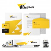
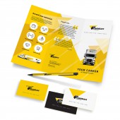
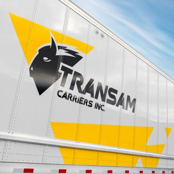
| DESIGN NAME: Transam Carriers PRIMARY FUNCTION: Brand Identity INSPIRATION: The roots of the brand grow from Eastern Europe where the rare animal Zubr, or European Bison, is the biggest animal, symbolizes uniqueness and power. It has a very similar look to American Bison. For Native Americans, the Bison was also quite sacred and respected. Transam Carriers began using the Bison image starting from the second logo version to convey the spirit of its brand. UNIQUE PROPERTIES / PROJECT DESCRIPTION: Transam Carriers Inc. is a leading transportation and logistics provider based in Toronto, Ontario, serving both Canada and the United States. The growing competition and truck driver shortage in the trucking industry of North America required the company to pay extra attention to its brand appearance. These market conditions led Transam Carriers to the decision to expand its marketing activity and redesign the brand. The current visual identity is the third update of its style in 16 years. OPERATION / FLOW / INTERACTION: We believe that as each person has its own personality, each business should have its unique identity. As a design studio, our obligation was to endow the brand characteristics that go in line with the corporate idea and people that interact with the brand. We have achieved this by using the stylized Zubr symbol, individually designed fonts, colors, and corresponding graphics. PROJECT DURATION AND LOCATION: The project started in September 2017. Designed and currently supported by NUMZ Graphics. FITS BEST INTO CATEGORY: Graphics, Illustration and Visual Communication Design |
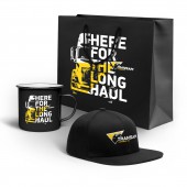
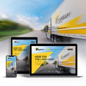
PRODUCTION / REALIZATION TECHNOLOGY: The style dictated by the logo has been successfully implemented on the corporate trucks, website, social media, stationery, advertising, and promotional products. Using yellow triangles in the graphics became very recognizable among the industry professionals. SPECIFICATIONS / TECHNICAL PROPERTIES: In addition to the Zubr symbol, there are two primary colors, yellow and black, as well as a unique font that were used to make the brand pop up. The head of the animal was fit into a triangle, which, with the slanted font, creates a dynamic look for the logo. TAGS: logo, symbol, visual identity, branding, corporate identity, graphic design, Canada, NUMZ Graphics RESEARCH ABSTRACT: To make a unique logo, we have analyzed major competitors on the subject of their appearance and color preferences. We have also conducted a survey inside the company and, based on the experience of the company’s experts, have built a website that aimed to engage the truckers and potential clients. CHALLENGE: Designing a brand is a big responsibility and we are lucky when we are trusted. Even though it is a very interesting job, to combine all the ideas and requirements into one graphic element that should look beautiful, be unique, and stay modern is a big challenge. Eventually, we developed 3 different concepts and after several iterations, we came to what we have. ADDED DATE: 2022-03-18 05:25:39 TEAM MEMBERS (1) : Designer: Maksim Zinchuk IMAGE CREDITS: Maxim Zinchuk, NUMZ Graphics |
||||
| Visit the following page to learn more: https://numzgraphics.com/trans | |||||
| AWARD DETAILS | |
 |
Transam Carriers Brand Identity by Maksim Zinchuk is Winner in Graphics, Illustration and Visual Communication Design Category, 2021 - 2022.· Read the interview with designer Maksim Zinchuk for design Transam Carriers here.· Press Members: Login or Register to request an exclusive interview with Maksim Zinchuk. · Click here to register inorder to view the profile and other works by Maksim Zinchuk. |
| SOCIAL |
| + Add to Likes / Favorites | Send to My Email | Comment | Testimonials | View Press-Release | Press Kit |
Did you like Maksim Zinchuk's Graphic Design?
You will most likely enjoy other award winning graphic design as well.
Click here to view more Award Winning Graphic Design.


