Granovita Granola Packaging by Olga Takhtarova |
Home > Winners > #139398 |
 |
|
||||
| DESIGN DETAILS | |||||
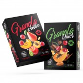
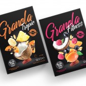
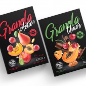
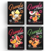
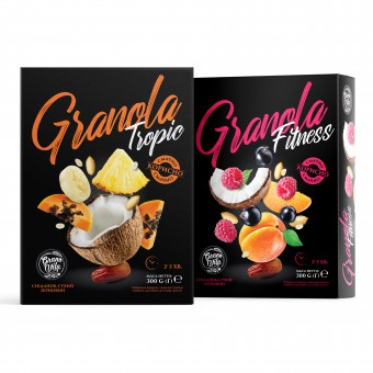
| DESIGN NAME: Granovita PRIMARY FUNCTION: Granola Packaging INSPIRATION: Over the past few years, the general trend towards a healthy lifestyle has been changing in the Ukrainian market. Gradually, unhealthy snacks on store shelves are being replaced by healthy analogues. Among them is granola. Granovita is a young Ukrainian brand founded in 2016. The brand positions itself as a product for breakfast and energy during the day. The company's mission is to promote healthy and balanced nutrition. At the moment the line is represented by Aktiv, Fitness, Unior, Tropic. UNIQUE PROPERTIES / PROJECT DESCRIPTION: To have more control over how the packaging "lives" on the shelves, the designer suggested using a cardboard box instead of a flexible doy-pack. The idea behind using the rough surface of the box as the sides of the packaging is to help express "healthy living". The use of delicious images of fruits and grains in the design encourages consumers to buy Granovita granola even more. OPERATION / FLOW / INTERACTION: By combining granola packaging with modern design, the designer has created an image that invites customers to rediscover breakfast. The new granola brand wants to bring change to the cereal market. Granola packaging should reflect the brand message. It should also connect with customers and stimulate sales. PROJECT DURATION AND LOCATION: This project started in January 2021 and finished in 2021 July in Dnipro. Ukraine FITS BEST INTO CATEGORY: Packaging Design |
PRODUCTION / REALIZATION TECHNOLOGY: Two important trends in grain packaging: flexible packaging and environmentally friendly materials. This is why cardboard, which can be composted, was used. An environmentally friendly packaging solution that still keeps costs down. SPECIFICATIONS / TECHNICAL PROPERTIES: 1 boxes 160mm x 120mm x 40mm TAGS: Granola, Granola packaging, Fruit Granola, Ukraine RESEARCH ABSTRACT: The illustrations on the packaging not only describe the taste of each product, but also represent a happy and healthy lifestyle. Icons and expressive inscriptions, bring the product to life. The bright colors convey a positive message. CHALLENGE: The main goal was to create a package design that would express appetite, naturalness, and healthiness. It was necessary to emphasize that this is a product of an active person, attentive to his health. ADDED DATE: 2022-03-17 08:45:13 TEAM MEMBERS (1) : IMAGE CREDITS: Olga Takhtarova, 2021. |
||||
| Visit the following page to learn more: https://sotdesign.com/ | |||||
| AWARD DETAILS | |
 |
Granovita Granola Packaging by Olga Takhtarova is Winner in Packaging Design Category, 2021 - 2022.· Read the interview with designer Olga Takhtarova for design Granovita here.· Press Members: Login or Register to request an exclusive interview with Olga Takhtarova. · Click here to register inorder to view the profile and other works by Olga Takhtarova. |
| SOCIAL |
| + Add to Likes / Favorites | Send to My Email | Comment | Testimonials | View Press-Release | Press Kit |
Did you like Olga Takhtarova's Packaging Design?
You will most likely enjoy other award winning packaging design as well.
Click here to view more Award Winning Packaging Design.


