Bank of England Visual Identity by Matteo Ruisi and Peter McCabe |
Home > Winners > #138983 |
 |
|
||||
| DESIGN DETAILS | |||||
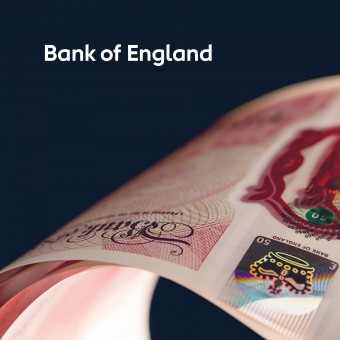
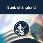
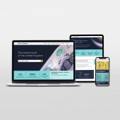
| DESIGN NAME: Bank of England PRIMARY FUNCTION: Visual Identity INSPIRATION: The Bank of England has recently embraced new forms of communicating. Its vision is to be open, inclusive, and straightforward to reach a wider audience. However, it is hard to conjugate staff-led technical outputs and general communications in a manner that the visuals meet the vision consistently. To solve that, the visual identity has been brought more in line with the Bank's values, purpose, and mission to get closer to the public it serves. UNIQUE PROPERTIES / PROJECT DESCRIPTION: The new visual identity for the Bank of England has been designed following four key principles: accessibility, relevance, structure, distinctiveness. The new logo is designed with a dyslexia friendly type. The Britannia seal is more welcoming and inclusive. Colours are inspired by the notes. Photography depicts the design of the Bank's notes. Charts and diagrams have been created together with wider staff. Accessibility charities have been consulted at different stages. OPERATION / FLOW / INTERACTION: The new visual identity system has been designed in collaboration with Bank of England staff. This has greatly benefited the effectiveness of the design outputs. Logo, colours, and typography has been designed to be relevant, distinctive, and accessible, especially for colour-blind people and people with dyslexia. A comprehensive online brand portal has been created for staff and designers to use. The Bank produces thousands of charts every year, therefore a one-size-fits-all template for the charts has been designed. A new CSS has been introduced to enhance accessibility. PROJECT DURATION AND LOCATION: The project started in 2020 during the pandemic, and it has been entirely done remotely. This has facilitated interaction with all relevant teams. It has been published on 3 March 2022. FITS BEST INTO CATEGORY: Graphics, Illustration and Visual Communication Design |
PRODUCTION / REALIZATION TECHNOLOGY: Adobe Illustrator, Adobe InDesign, Adobe Photoshop, Adobe After Effects, Frontify.com, HTML and CSS. SPECIFICATIONS / TECHNICAL PROPERTIES: Not applicable TAGS: Accessible, relevant, structured, distinctive, optimised, simple, balanced RESEARCH ABSTRACT: The most effective way for the Bank to be understood lies in the accessibility aspect. The content the Bank produces is very technical, and difficult to understand. Sometimes even for a trained audience. Accessibility experts have been involved at different stages. They've contributed to the definition of a creative strategy and a design solution that improves the readability of the Bank contents, especially regarding charts. CHALLENGE: The biggest challenge was to define an effective balance between accessible contents, very technical and sensitive information, staff-led outputs, chart design, and engaging general communications. The project has been entirely managed in-house, to get the opportunity to involve wider staff in delicate aspects of the design process. This approach has guaranteed the simplification and optimisation of the design process. ADDED DATE: 2022-03-08 11:55:04 TEAM MEMBERS (2) : Lead Designer: Matteo Ruisi and Designer: Peter McCabe IMAGE CREDITS: Image #2: Illustrator Chris Mitchell Image #3: Photographer Lee Funnell Video Credits: Nicholas Flanagan Copyrights The Governor and Company of the Bank of England. All Rights Reserved. PATENTS/COPYRIGHTS: Copyrights belong to The Governor and Company of the Bank of England. All Rights Reserved. |
||||
| Visit the following page to learn more: http://bit.ly/3vLqAU9 | |||||
| AWARD DETAILS | |
 |
Bank of England Visual Identity by Matteo Ruisi and Peter McCabe is Winner in Graphics, Illustration and Visual Communication Design Category, 2021 - 2022.· Press Members: Login or Register to request an exclusive interview with Matteo Ruisi and Peter McCabe. · Click here to register inorder to view the profile and other works by Matteo Ruisi and Peter McCabe. |
| SOCIAL |
| + Add to Likes / Favorites | Send to My Email | Comment | Testimonials | View Press-Release | Press Kit |


