Le Dior Spa Cheval Blanc Paris Multifunctional Logo by Made for you |
Home > |
 |
|
||||
| DESIGN DETAILS | |||||
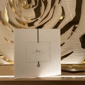
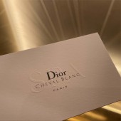
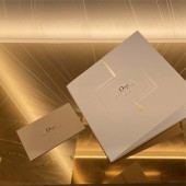
| DESIGN NAME: Le Dior Spa Cheval Blanc Paris PRIMARY FUNCTION: Multifunctional Logo INSPIRATION: It was important that the visual identity represented the luxurious environment of the spa in order to offer a complete experience of escape for the customer. UNIQUE PROPERTIES / PROJECT DESCRIPTION: Made for you took up the difficult challenge of combining the two brand’s worlds to create a logo for use on all communication materials. Given that the name of the spa is relatively long, consisting of 5 words, the team wanted to find a subtle and elegant visual balance. The typographies of the 2 brands’ logos are combined to create a sophisticated but streamlined logo. The word “SPA” is subtly added in the background, while the word “Paris” is shown underneath, slightly set apart. The combination of different sizes and colors creates a subtle balance, creating a logo which is legible and sleek. OPERATION / FLOW / INTERACTION: - PROJECT DURATION AND LOCATION: - |
PRODUCTION / REALIZATION TECHNOLOGY: - SPECIFICATIONS / TECHNICAL PROPERTIES: - TAGS: (logo) (luxury) (visual identity) (spa) (communication material) RESEARCH ABSTRACT: - CHALLENGE: - ADDED DATE: 2022-02-28 13:39:52 TEAM MEMBERS (1) : Creative Director: Fanny de Bray and Artistic Director: Anna Cesa IMAGE CREDITS: Made for you, 2021. |
||||
| Visit the following page to learn more: https://www.madeforyou-agency.com/dior-s |
|||||
| AWARD DETAILS | |
 |
Le Dior Spa Cheval Blanc Paris Multifunctional Logo by Made For You is Runner-up for A' Design Award in Luxury Design Category, 2021 - 2022.· Press Members: Login or Register to request an exclusive interview with Made for you. · Click here to register inorder to view the profile and other works by Made for you. |
| SOCIAL |
| + Add to Likes / Favorites | Send to My Email | Comment | Testimonials |

