Nisshin Seifun Group Snowflake Logos and Branding by Eg Plus Worldwide Japan - Designory Japan |
Home > Winners > #137888 |
 |
|
||||
| DESIGN DETAILS | |||||
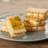
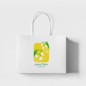
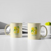
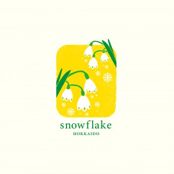
| DESIGN NAME: Nisshin Seifun Group Snowflake PRIMARY FUNCTION: Logos and Branding INSPIRATION: As the name implies, the logo is based on a snowflake flower, and the color is yellow, which means bright and happy. The client was so impressed with our logo that they made a special sable with this logo on it and gave it to us as a surprise gift to thank us. UNIQUE PROPERTIES / PROJECT DESCRIPTION: A new brand of confectionery flour made from 100% Hokkaido wheat. This product is targeted at patisseries that are particular about their ingredients. Since this is the successor to a product called Melty snow, we designed a logo with a familiar name, an appeal to the fact that it is made in Hokkaido, and a symbolic cuteness. OPERATION / FLOW / INTERACTION: - PROJECT DURATION AND LOCATION: The project took place in the March of 2021. The project duration was 2 months. |
PRODUCTION / REALIZATION TECHNOLOGY: - SPECIFICATIONS / TECHNICAL PROPERTIES: Branding (logo, advertising) TAGS: Branding, Logo, Advertisement RESEARCH ABSTRACT: We carefully researched the client's target customers, the purpose of the product, where it would be sold, and where it was expected to be transacted, before starting work on the logo mark. CHALLENGE: Our challenge was to figure out how to sell the newly launched wheat within COVID-19 and how to communicate with the new target audience. ADDED DATE: 2022-02-28 07:45:15 TEAM MEMBERS (2) : Mitsuo Nushimura (ACD) and Shoko Torigoe (AD) IMAGE CREDITS: Picture1, 2,3 and 4/Shoko Torigoe , Mitsuo Nishimura |
||||
| Visit the following page to learn more: https://www.e-kinoshita.kyoto/archives/1 |
|||||
| AWARD DETAILS | |
 |
Nisshin Seifun Group Snowflake Logos and Branding by Eg Plus Worldwide Japan-Designory Japan is Winner in Graphics, Illustration and Visual Communication Design Category, 2021 - 2022.· Press Members: Login or Register to request an exclusive interview with Eg Plus Worldwide Japan - Designory Japan. · Click here to register inorder to view the profile and other works by Eg Plus Worldwide Japan - Designory Japan. |
| SOCIAL |
| + Add to Likes / Favorites | Send to My Email | Comment | Testimonials | View Press-Release | Press Kit |

