DESIGN NAME:
Hocan Healthy
PRIMARY FUNCTION:
Corporate Identity
INSPIRATION:
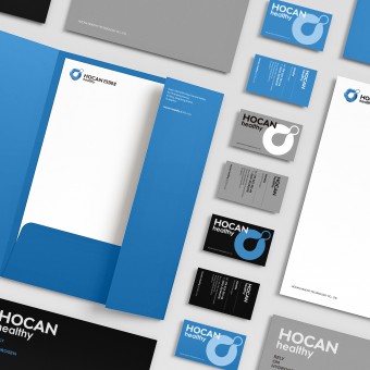
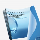
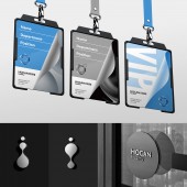
Hocan healthy mainly develops intelligent technology products around 'hydrogen drinking water, hydrogen breathing and hydrogen health care'. In the design of the logo, we summarized the 'hydrogen molecule' into a more focused circle, showing the change process between water and hydrogen in the form of positive and negative shapes, and skillfully expressing the industrial features of the brand. Boldly use technology blue as the main color, and cooperate with three-dimensional modeling to make it significantly different from similar brands and increase consumer attention.
UNIQUE PROPERTIES / PROJECT DESCRIPTION:
As a provider of hydrogen and oxygen health technology industry, the upgraded 'Hocan healthy' is concise, modern and full of technology in the overall visual effect. With the increasing role of three-dimensional dynamic aesthetics in conveying brand personality, not only does the logo become an image symbol of the coexistence of business and art, which highlights the brand personality, but also is more suitable for digital communication, and invisibly outputs a deeper brand awareness.
OPERATION / FLOW / INTERACTION:
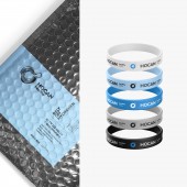
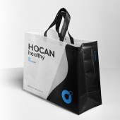
The design creates a unified brand image system. Whether it is in the early stage, the design process, and the implementation, the brand spirit can run through, and it is inseparable from the strongest cooperation between design and craftsmanship. The new logo can continuously switch between two-dimensional and three-dimensional in terms of changes in different materials and processes, but it always remains recognizable. Its flexible three-dimensional shape is full of vitality and possibility.
PROJECT DURATION AND LOCATION:
The project started in April 2021 in Guangzhou and finished in October 2021 in Guangzhou, and was exhibited in November 2021 in Guangzhou.
FITS BEST INTO CATEGORY:
Graphics, Illustration and Visual Communication Design
|
PRODUCTION / REALIZATION TECHNOLOGY:
To create a consistent visual system, all the necessary PMS color codes were provided for printed and digital media. In addition, RAL equivalents of these colors and fabric colors were also selected for the interior space.
SPECIFICATIONS / TECHNICAL PROPERTIES:
The logo and visual system are designed in vector format to make it suitable for different sizes of digital and printed media. In order to prevent the mis-production of any items, we have prepared a comprehensive brand logo guidelines manual.
TAGS:
Logo, Branding, Visual Identity, Graphic Design, Interior Design
RESEARCH ABSTRACT:
According to analysis, most of the brands in the same field are showing signs of disorder, slowness and weakness, and lack of brand awareness. Therefore, Hocan healthy has ushered in a comprehensive upgrade, and the new visual identity presents a three-dimensional form, establishing a strong visual anchor to describe the brand's belief in innovation and bringing consumers a modern and fresh visual experience.
CHALLENGE:
The most challenging part of this project was to find a suitable design language to effectively visualize abstract ideas and interpret the temperament and connotation of the brand.
ADDED DATE:
2022-02-27 08:47:02
TEAM MEMBERS (2) :
Creative Director: Zhiji Dong and Designer: Lu Gu
IMAGE CREDITS:
Guangzhou Cheung Ying Design Co. Ltd., 2021.
|
