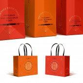
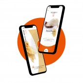
ZhenYue Logo and Brand Identity by Guangzhou Cheung Ying Design Co. Ltd. |
Home > Winners > #137424 |
| CLIENT/STUDIO/BRAND DETAILS | |
 |
NAME: Guangzhou Cheung Ying Design Co., Ltd. PROFILE: Guangzhou Cheung Ying Design Co.,Ltd. is a professional organization offering comprehensive and creative designs. It focuses on personalized brand experience and imbeds design thinking into various fields, which is to provide accurate and effective design language and visual solutions for brand establishment and application communication. They have no fixed model, no fixed style, and no fixed boundaries. Their unique, flexible and smart model affects their design thinking and project operations. Through the integration capability of multi-dimensional excavation of the brand's unique DNA, they create a brand that resonates with people while allowing the brand to have sustainable competitiveness in a diversified market. |
| AWARD DETAILS | |
 |
Zhenyue Logo and Brand Identity by Guangzhou Cheung Ying Design Co. Ltd is Winner in Graphics, Illustration and Visual Communication Design Category, 2021 - 2022.· Read the interview with designer Guangzhou Cheung Ying Design Co. Ltd. for design ZhenYue here.· Press Members: Login or Register to request an exclusive interview with Guangzhou Cheung Ying Design Co. Ltd.. · Click here to register inorder to view the profile and other works by Guangzhou Cheung Ying Design Co. Ltd.. |
| SOCIAL |
| + Add to Likes / Favorites | Send to My Email | Comment | Testimonials | View Press-Release | Press Kit |
Did you like Guangzhou Cheung Ying Design Co. Ltd's Graphic Design?
You will most likely enjoy other award winning graphic design as well.
Click here to view more Award Winning Graphic Design.


